Due to being in lockdown, I was unable to get “out and about” as suggested in the brief, so have instead found examples of images and text that one may be exposed to in the ‘real world’ from advertisements I found in my home and from browsing social media platforms. I have tried to find examples that relate to directional, orientation and complementary titles.
Directional titles
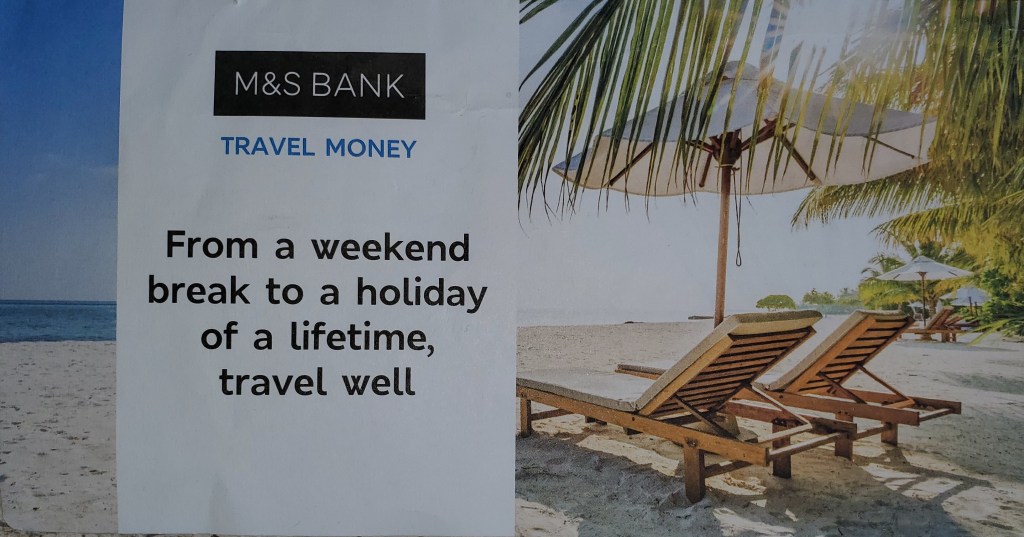
The example I have chosen that I think relates to a ‘directional title’, is an advertisement from M&S bank that is specifically marketing travel money. In this instance, the text does in fact close the image down, and leaves the viewer very little option to form their own interpretations surrounding its meaning. There are three key elements depicted in the image itself that are commonly used in the tagline to represent ‘holidays’ – sun, sea and sand. With the addition of deck chairs and palm trees, most viewers would associate this ‘scene’ to a luxury destination. The text and image support each other incredibly well, as for many, the type of holiday depicted would indeed be a ‘holiday of a lifetime’. And, though there are many reasons for this, the most obvious and relatable to this advertisement, is financial implications. I think this advertisement is less about travel money, and more about banking in general – specifically with M&S. Perhaps, subliminally, the message they are trying to promote is if people invest their money in their bank, a holiday like the one shown is possible.
Orientation titles
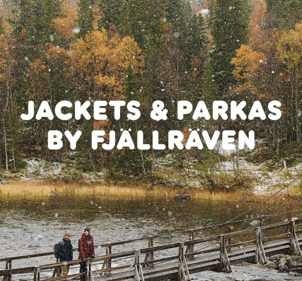
An advertisement that I believe is relatable to ‘orientation titles’, is one created by Swedish company ‘Fjallraven’, who specialise in outdoor equipment. The text used, does close the image down, in regards to informing the viewer about the products that are being promoted. However, due to how the text and image support each other, I believe the viewer is still able to form their own interpretations. By reading the text, we know that the products being advertised are jackets and parkas, produced by a well-known and reputable company. Even if the viewer is unfamiliar with the brand, it certainly reads and sounds Scandinavian, so could be assumed that a company from this region would make quality products of this type. The products themselves have been depicted in a non-obvious way, and certainly aren’t the main focal point within the advertisement. This makes me think that this is less about the products themselves, and more to do with where and how they can be used, because of the qualities they possess. That is why the majority of the image shows a wild and rugged landscape, in an environment that is susceptible to the worst elements, for example, snow.
Complimentary titles
I must admit that this ‘type’ of title is the one I found hardest to understand, so I’m hoping that the advertisement I have chosen is relatable to this. As we can see, the brand that is being promoted is Huawei, who are an ITC company, but more commonly known for their mobile phones. But, if we look at the image, there is nothing depicted that could be relatable to either ITC or mobile phones, apart from the “stay connected” hashtag at the bottom perhaps. Because the text and image don’t support each other in terms of providing a definitive meaning, the advertisement is left very much ‘open’ and allows the viewer to form their own interpretations, which in turn, will help them understand the possible meaning behind the advertisement. Having looked again and again at this advertisement, I still have no idea what the intention is behind it.

