Exercise 4: Alternative Interpretations

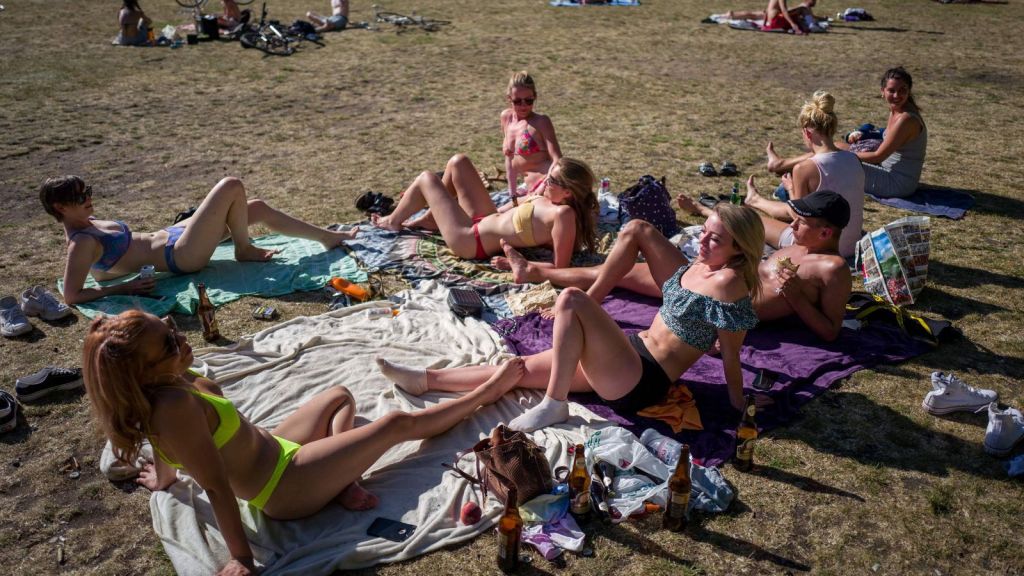
This image, from the Sun newspaper, supports an article discussing the ‘test and trace’ system being launched throughout the U.K. and the possible dangers of coming into close contact with asymptomatic individuals’, now lockdown measures have been somewhat lifted. Personally, I feel that since the ‘rules’ have been relaxed in Scotland, a minority of people certainly aren’t respecting them. As I live beside a beach that has been visited regularly by many people over the last few weeks due to the good weather, I have become all too familiar with witnessing scenes like that seen in the image. Of course, I’m as happy as the next person that some ‘normality’ has been brought back into our lives, but this needs to be done sensibly and respectably. The original caption reads, “With coronavirus often asymptomatic, without contact tracing it’s hard to know if you’ve been near an infected person”.

Negative captions

“Individuals’ ignoring government guidelines now coronavirus lockdown measures have been relaxed. But, at what cost?”

“Respect social distancing to avoid close contact with asymptomatic Covid carriers.”

“New Covid cases likely. But who will be to blame? The public or Government?”

Positive captions

“Freedom from full lockdown! Soaking up the sun after weeks of being stuck indoors.”

“Sun, sea and friendships reunited. A sense of normality now measures eased.” 

“Life’s a beach now lockdown rules relaxed.”

Re-contextualised captions

“The man with seven wives. Fury as marriage laws change in U.K.”

“Skin cancer in U.K. at an all-time high. People urged to use sunscreen.”

“Bikinis in the U.K. to be banned from next year. Some women already adjusting for the change.”

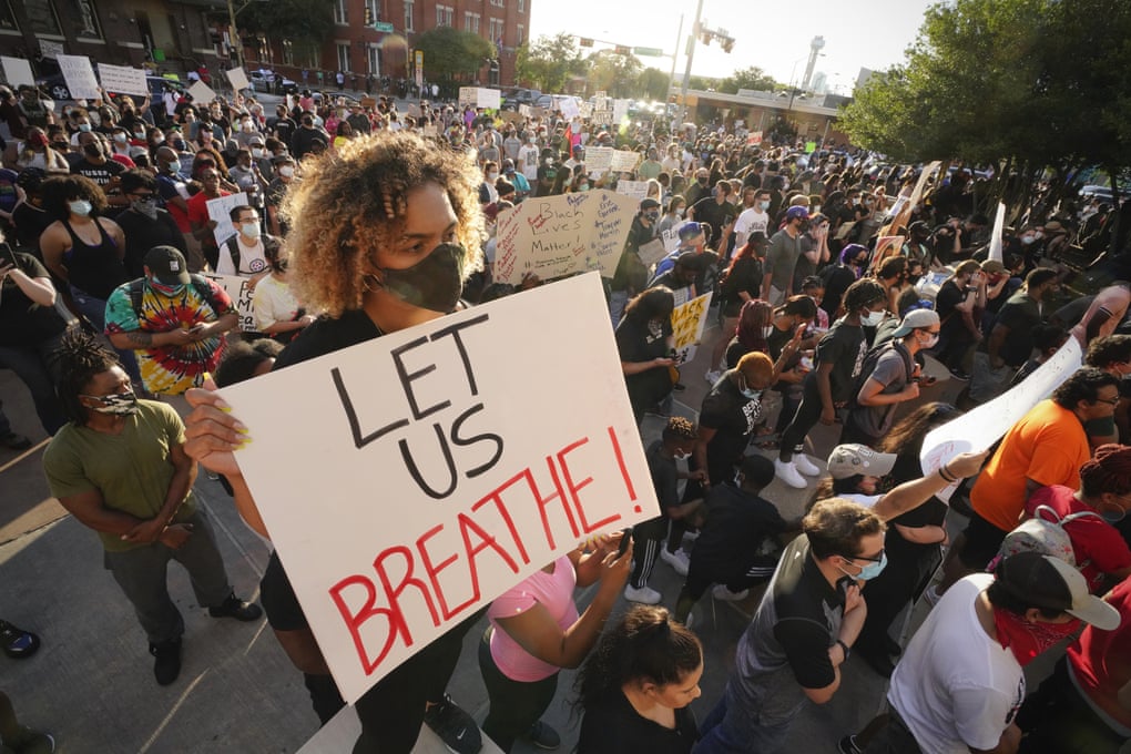
This image, from the Guardian newspaper, supports an article about the murder of George Floyd whilst in police custody, and subsequently, the protests that followed – some peaceful, some not – specifically seen across America. Most believe this was a pre-meditated and racially motivated murder – as Floyd was a black man – rather than a case of bad policing. Unfortunately, racial profiling by police officers – specifically towards black individuals’ – has become all too familiar in recent years across the U.S. In response, social movements such as ‘Black Lives Matter’ have been created to raise awareness of the problem. “Let us breathe” has become the ‘message’, if you will, seen throughout the protests, and symbolises Floyd’s last words “I can’t breathe”, as a result of a police officer kneeling on Floyd’s neck, whilst he was unarmed, handcuffed and lying face down on the road. The original caption read ‘How the killing of George Floyd has upended America’.

Negative captions

“Second wave of Coronavirus feared, as mass crowds gather for George Floyd protest.”

“Masks being used to conceal identities NOT for Covid protection.”

“Reading between the lines will result in more deaths on black individuals’ at the hands of the police.”

Positive captions

“George Floyd protestors show signs of hope.”

“One race unified.”

“Peaceful protesters air their views.”

Re-contextualised captions

“Californian residents raise concerns over rising pollution levels.”

“Americans angered. Wearing masks to combat Covid-19 to become mandatory.”

“Inhalers run out of production in some U.S states. Asthma sufferers concerned.”

This exercise showed me that it’s actually very easy to use text in the form of captions, in order to solidify meaning to an image, as long as what is written has some relevance to what is being shown. Captions are primarily used to give an insight into the story that relates somehow to the photograph. However, whether an image has positive or negative connotations – regardless of what is depicted – depends entirely on the captions used. I also learnt that one image could have multiple captions attached to it, where in theory, each created a different story surrounding the photograph. I’m not certain that photograph captions are ever used in a dishonest manner when featured in newspapers or magazines. However, if they weren’t featured alongside a main article, the truth could certainly be questionable.

Thinking about how I could use what I’ve learnt in my own work, perhaps an interesting project would be to produce a series of images’ that portray both positive and negative scenes, but use connotations that are the opposite to what is being portrayed. Could using text in this regard change the meaning of an image that isn’t considered neutral – like those I used for this exercise.     

References

The Guardian. (2020). ‘Protests rock cities across US as anger over George Floyd’s killing spreads’ [online] Available from: https://www.theguardian.com/us-news/2020/may/29/george-floyd-killing-protests-us-police

Sky News. (2020). Coronavirus: ‘How will England’s test and trace system work?’ [online] Available from: https://news.sky.com/story/coronavirus-how-will-englands-test-and-trace-system-work-11995695

Exercise 3: Storyboard

I actually found this to be a more challenging exercise than I initially thought. I have a better understanding of how difficult it can actually be to create an image – without the inclusion of text – that depends solely on what is depicted within the frame, and how the image as whole is presented to the viewer, to solidify the narrative that is trying to be communicated to them. On the other hand, I now realise how by including carefully chosen text, how simple it can be to add new meaning to the narrative. In this instance, this new information paints a picture for the viewer in regards to what may happen next, but also, gives meaning to ‘frames’ seen previously. A good example of this, is the relationship between frames 2 and 6. The viewer should be able to piece together that the reason why the tree has fallen over in frame 6, is because of the storm mentioned in frame 2. Also, I found it interesting that symbols can be used instead of letters – as seen in frame 7 – and as this is a familiar method commonly used and seen to represent obscene words, the narrative hasn’t been obscured in any way.

Research Task: Rhetoric of the Image

Though I found ‘Rhetoric of the image’ to be a very fascinating essay on Barthes’ outlook on ‘messages’ within photography, his use of intellectual expressions – such as one would expect from a literal theorist – made it at times hard to decipher and digest. Feeling I was reading an extract from a scientific paper, I initially struggled to connect with the piece, resulting in multiple reads to help me grasp a basic understanding.

Barthes purposely chose an image from an advertising campaign – ‘Panzani’ – as he believed a globally-recognised subject, which is intended to be expressed forcibly, can be interpreted more easily by the viewer. I immediately thought of advertisement boards found at airports, where, regardless of the country and language they’re in, the meaning behind them is more often than not identifiable.

Barthes explains that, for a meaning or ‘sign’ to be gained, a ‘signifier’ and ‘signified’ must be present. In layman’s terms, a ‘signifier’ is something, for example a word or an image, that conveys the meaning, whereas ‘signified’ is a mental concept drawn from the signifier. An example of this would be produce spilling out onto a table, due to the bag being left open (signifier), conceptualising that an individual had just returned from a market with fresh ingredients (signified).

Barthes refers to three types of messages that are usually found within an image – ‘linguistic’, ‘denoted’ and ‘connoted’. But, for the purpose of this ‘research task’, I will only give explanation to the first.

‘Linguistic’ messages are, fundamentally, titles or captions that accompany an image, and are commonly seen in advertisements and press photography. ‘Anchor’ and ‘relay’ are common terms that support a ‘linguistic’ message, and they are used in differing ways. In his essay, Barthes makes this references to ‘anchorage’. “The text is indeed the creator’s (and hence society’s) right of inspection over the image; anchorage is a control, bearing a responsibility – in the face of the projective power of pictures – for the use of the message.” In simpler terms, ‘Anchoring’ is employed to guide the viewer through a number of possible interpretations to the single intended meaning of the image. On the contrary, Barthes defines ‘relay’ as “text and image stand in a complementary relationship; the words, in the same way as the images, are fragments of a more general syntagm”. In other words, ‘relay’ means that text and image are designed to work in unison to convey an intended meaning.

I think a good example of ‘anchorage’ can be seen in a previous assignment I have done, specifically, ‘Vice Versa’. Though, the text has been used as captions, rather than featuring in the images’ themselves, they still help to direct the viewer towards the intended meaning of the photographs’, and restricts them forming their own interpretations that may lead to the intended meaning to be false. https://iainbarbourocaiap.photo.blog/category/assignment-2/

I believe the advertisement below is a good example of ‘relay’, as the text is giving meaning that is not found in the image itself. Essentially, they are working separately and each is supplying their own bit of information to help aid the intended message.

I think understanding the concept of ‘anchorage’ and ‘relay’, would be very beneficial if working on a project, for example, that uses text and image. As both the photographer and the creator of text – if you will – you immediately have control on how you want the photograph’s meaning to be perceived by the viewer. Essentially, you would have an opportunity to influence the viewer, in the way you want them to be influenced.   

References

Barthes, Roland. (1964). ‘Rhetoric of the image’ [Online] Available from: https://faculty.georgetown.edu/irvinem/theory/Barthes-Rhetoric-of-the-image-ex.pdf

The Design Café. (2020). [Online] Available from: http://www.thedesigncafe.net/facebook-advertisments.html

‘races of the real. (2009). ‘The Rhetoric Of The Image – Roland Barthes (1964)’ [Online] Available from: https://tracesofthereal.com/2009/12/21/the-rhetoric-of-the-image-roland-barthes-1977/

Exercise 2: Reflective Day

Due to being in lockdown, I was unable to get “out and about” as suggested in the brief, so have instead found examples of images and text that one may be exposed to in the ‘real world’ from advertisements I found in my home and from browsing social media platforms. I have tried to find examples that relate to directional, orientation and complementary titles.

Directional titles

The example I have chosen that I think relates to a ‘directional title’, is an advertisement from M&S bank that is specifically marketing travel money. In this instance, the text does in fact close the image down, and leaves the viewer very little option to form their own interpretations surrounding its meaning. There are three key elements depicted in the image itself that are commonly used in the tagline to represent ‘holidays’ – sun, sea and sand. With the addition of deck chairs and palm trees, most viewers would associate this ‘scene’ to a luxury destination. The text and image support each other incredibly well, as for many, the type of holiday depicted would indeed be a ‘holiday of a lifetime’. And, though there are many reasons for this, the most obvious and relatable to this advertisement, is financial implications. I think this advertisement is less about travel money, and more about banking in general – specifically with M&S. Perhaps, subliminally, the message they are trying to promote is if people invest their money in their bank, a holiday like the one shown is possible.

Orientation titles

An advertisement that I believe is relatable to ‘orientation titles’, is one created by Swedish company ‘Fjallraven’, who specialise in outdoor equipment. The text used, does close the image down, in regards to informing the viewer about the products that are being promoted. However, due to how the text and image support each other, I believe the viewer is still able to form their own interpretations. By reading the text, we know that the products being advertised are jackets and parkas, produced by a well-known and reputable company. Even if the viewer is unfamiliar with the brand, it certainly reads and sounds Scandinavian, so could be assumed that a company from this region would make quality products of this type. The products themselves have been depicted in a non-obvious way, and certainly aren’t the main focal point within the advertisement. This makes me think that this is less about the products themselves, and more to do with where and how they can be used, because of the qualities they possess. That is why the majority of the image shows a wild and rugged landscape, in an environment that is susceptible to the worst elements, for example, snow.

Complimentary titles

I must admit that this ‘type’ of title is the one I found hardest to understand, so I’m hoping that the advertisement I have chosen is relatable to this. As we can see, the brand that is being promoted is Huawei, who are an ITC company, but more commonly known for their mobile phones. But, if we look at the image, there is nothing depicted that could be relatable to either ITC or mobile phones, apart from the “stay connected” hashtag at the bottom perhaps. Because the text and image don’t support each other in terms of providing a definitive meaning, the advertisement is left very much ‘open’ and allows the viewer to form their own interpretations, which in turn, will help them understand the possible meaning behind the advertisement. Having looked again and again at this advertisement, I still have no idea what the intention is behind it.

Design a site like this with WordPress.com
Get started