Assignment Four: Image and Text – Reflections

I’m very proud of the work I’ve produced, and though this was an assignment I thoroughly enjoyed, I’m glad it’s now completed. I must admit that I didn’t realise how difficult it would be, to try and produce images’ from spoken text that I hadn’t heard prior to starting the process. There were certainly times throughout, where I really thought I’d bitten off more than I could chew, so to overcome that hurdle gives me a massive sense of achievement. I really wanted to challenge myself, and explore new ways to showcase my work, which I understood was critical for my development as both a student, and as a photographer – I feel I’ve done this.   

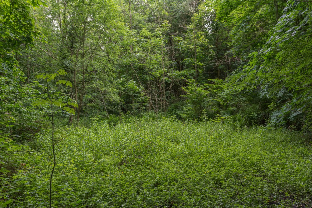
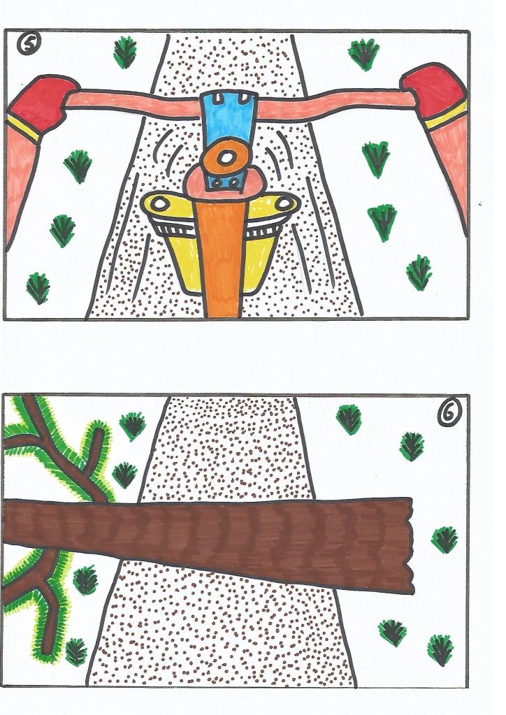
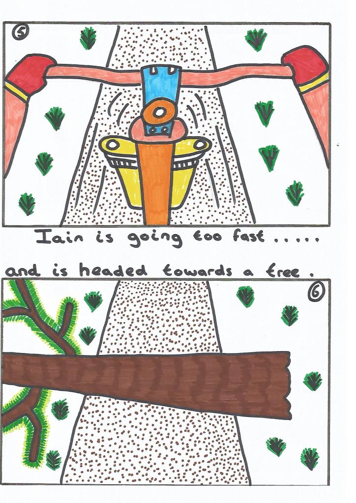
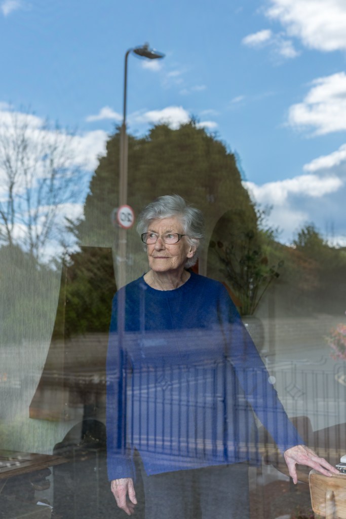
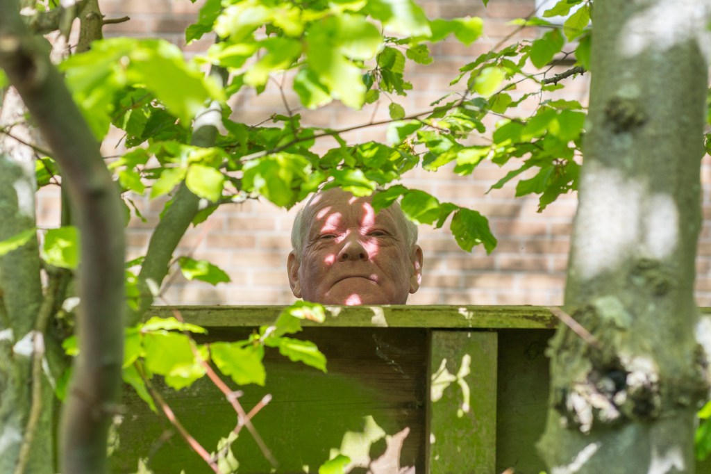
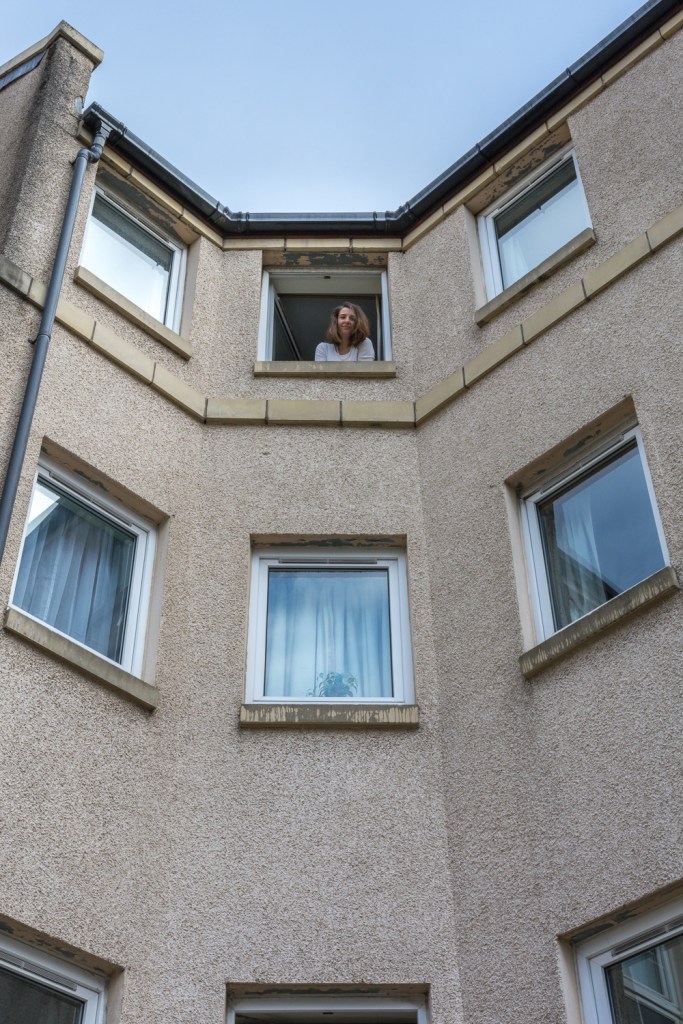
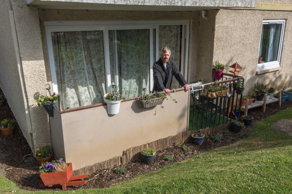
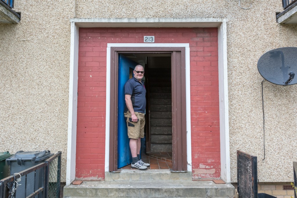
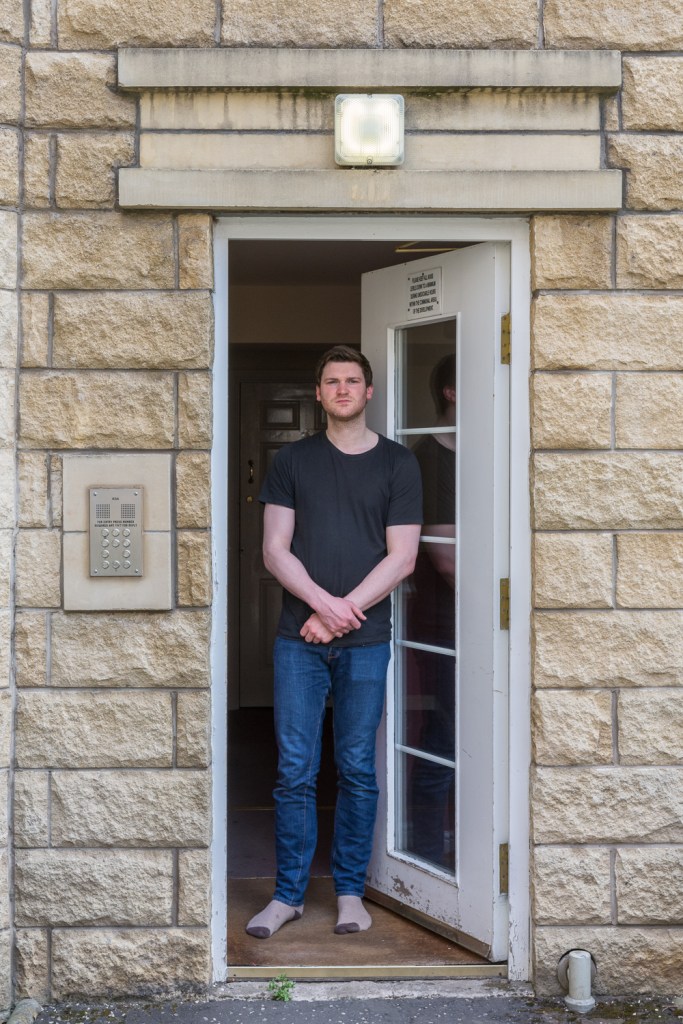
Taking into consideration past suggestions made by my tutor, I chose to incorporate flash into the photographic process, which is still a relatively new concept to me. Though, I certainly see the benefits, I feel that with more experience beforehand, I would have been able to utilise its functions more effectively, and perhaps, seen better results. However, this entire process is about gradual learning, and developing my skill set within different areas of photography, so I certainly cannot be too critical on myself in this regard. My compositions throughout, had to be carefully considered, and how I framed the scenes in order to best show the props I chose to use, was always at the forefront of my mind. For example, with the ‘briefcase’ image, if I’d chosen to use a different perspective, the money might not have been visible, or easily as identifiable to the viewer, resulting in misinterpretation that may affect the true meaning behind the image. I was also able to effectively use the natural elements – seen in images’ five and six – to create leading lines, helping to draw the viewer’s eye towards to point of interest. The concept of juxtaposition was always going to form naturally throughout the series, due to ‘man made’ objects being depicted within a natural setting. However, this was something I purposely intended during the planning stage, and I hope the viewer picks up on this.

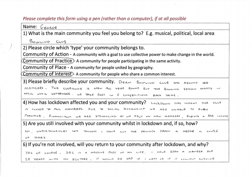
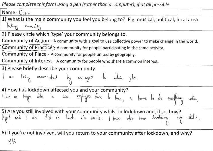
I always love using props in my photography, and though I found this particular part of the process challenging, it always allows me to explore my creativity, and use objects to express meaning in other ways. Choosing the props to use, in relation to the spoken text, had to be selected with careful consideration. I tried very hard not to allow the words to be descriptive of what was being depicted within the image, and ideally, didn’t want the props to mirror the ‘text’ in literal form. I feel I’ve managed to achieve this, though there could be question marks surrounding image five – the telephone. I wasn’t sure at the time, and still aren’t, what prop I could have used, to reflect this selected part of dialogue. However, to demonstrate the individual’s age, and the notion of generational differences, I purposely used a rotary style telephone, and therefore feel that it’s justified. I believe the prop I used most effectively that may be open to interpretation more than the others, are the cogs seen in image one. They were selected to reflect the personal development training the individual describes she has done during lockdown. I also think image six has been well utilised, in regards to the creativity aspect. It represents the common phrase “money doesn’t grow on trees”, meaning money must be earned – something the individual is struggling to do, as a result of his job being affected. Another way in which I’ve demonstrated my creativity, is by using video to present my images and spoken text – something I’ve not done previously. The process was extremely time consuming, and though the editing and presentation could’ve been better – again, part of my learning experience – I still think it was the best way to present my work, and has benefited my project on the whole.

This was an opportunity to use another element within my photography, to help with the intended narrative. Prior to this assignment, I’ve only used visual representations i.e. photographs and written text, to help achieve this. So, to incorporate spoken text in audio form, made for an interesting change. Overall, I feel the narrative is strong, both visually and audibly, and has made for a better project. I now feel I’ve the confidence to use this process – where appropriate – within my work in the future.

Assignment Four: Image and Text – Tutor feedback

Beginning with the positives, my tutor liked the idea of me starting the photographic process, only once all of the ‘lockdown stories’ had been heard. He felt this showed development in my learning and understanding, as it demonstrated giving each participant a sense of identity. I must admit, this was not something that I intended, but I’d like to think that it was done on a subconscious level, as it’s an element of my photography that I’ve been working hard on since assignment one. My tutor also commented on the last sentence I wrote in my essay, which read “This would also make certain that the intended narrative remained open for interpretation, making for a more meaningful project”. He admitted this raised his hackles slightly, was a ‘blanket phrase’, and questioned me on whether a photographic project needs to be open for interpretation to be meaningful. I see this as a positive, because at the same time, my tutor felt this statement seemed “harsh” on the work I’d produced, which to me, shows a level of appreciation on his part, on what I managed to achieve. This has also made me realise the importance of thinking carefully about statements I wish to make, before including them in any written piece. On reflection, I do agree with my tutors comments, and as a result, I’ll remove this sentence from my essay.

There were some areas of the assignment that will need to be re-worked, before assessment. The main issue my tutor had, regarded the sequencing of the images / audio, and the overall edit. As image one was considered, in his opinion, the most obscure in terms of its narrative – something I completely agree with – perhaps this should appear in the middle of the series, which would allow the viewer to gain some form of understanding of its intended meaning, from the photographs’ and ‘lockdown stories’ that are perhaps easier to interpret that appear prior. We had previously talked about starting a series with the ‘best’ image, which was my thought process in this instance. However, I now understand that this notion shouldn’t always be applied, and careful consideration must be made about which photographs appear where, to help strengthen the overall narrative. Also, I realise the importance of consistency, when using video to present your work, and more so, if spoken text has been used to support your images’. For example, the lockdown story – specifically related to image one – is far too long, and inconsistent with the others. This will need to be shortened when re-editing my video for assessment. What I found interesting – again, specifically related to image one – was that my tutor associated the cogs shown, to a personal incident surrounding a bike. This made me wonder if photographs have more impact than spoken word, even when they accompany each other.

I have been encouraged to look at photographers, who incorporate a range of multimedia in their work, for example, Susan Trangmar, or the multimedia section of WPP, as I feel this is an area I would like to explore further in the future. I’m currently looking at investing in the student package of adobe’s creative cloud, in order to improve, and have perhaps have more options when creating videos, specifically when using Premier Pro.

Exercise 5: Image and Text

The words I have chosen for this exercise, come from one of my favourite songs called ‘Coyotes’ by singer Don Edwards. The song tells a story of a cowboy, who is reflecting on how the world he once knew, has changed dramatically over the years. There are implications made of a deep connection between nature and man, and how we as a human race – in the cowboy’s eyes – have destroyed the landscape in front of us for our own needs. The song describes the continuous loss we experience as time passes – perhaps from our own doing – where in the end, the cowboy himself becomes ‘lost’.

My photographs were taken in and around the village where I reside, which has seen huge change since I first moved here thirty years ago. New housing developments have naturally caused a spike in population, and as a result, the landscape is forever changing. The village was the site of the earliest Roman settlement in Scotland, and throughout, I envisaged what the landscape would have been like back then, how radically it would have changed every few years, and what the Roman’s would have made of the village today. I wanted my images to reflect the passing of time and how people have shaped the landscape – for better and for worse. However, within all the photographs, the notion of nature is evident. Each image is supported by a line from the song, but I’ve been incredibly careful that the text adds meaning, rather than describing what’s depicted in the photograph.

“Part history, part sage, part mesquit”

“And he’ll tell you a tale of the old days, when the country was wild all around”

“Now the longhorns have gone, and the drovers are gone”

“Well he cursed all the roads and the oil men”

“In this new world of asphalt and steel”

Exercise 4: Alternative Interpretations

This image, from the Sun newspaper, supports an article discussing the ‘test and trace’ system being launched throughout the U.K. and the possible dangers of coming into close contact with asymptomatic individuals’, now lockdown measures have been somewhat lifted. Personally, I feel that since the ‘rules’ have been relaxed in Scotland, a minority of people certainly aren’t respecting them. As I live beside a beach that has been visited regularly by many people over the last few weeks due to the good weather, I have become all too familiar with witnessing scenes like that seen in the image. Of course, I’m as happy as the next person that some ‘normality’ has been brought back into our lives, but this needs to be done sensibly and respectably. The original caption reads, “With coronavirus often asymptomatic, without contact tracing it’s hard to know if you’ve been near an infected person”.

Negative captions

“Individuals’ ignoring government guidelines now coronavirus lockdown measures have been relaxed. But, at what cost?”

“Respect social distancing to avoid close contact with asymptomatic Covid carriers.”

“New Covid cases likely. But who will be to blame? The public or Government?”

Positive captions

“Freedom from full lockdown! Soaking up the sun after weeks of being stuck indoors.”

“Sun, sea and friendships reunited. A sense of normality now measures eased.” 

“Life’s a beach now lockdown rules relaxed.”

Re-contextualised captions

“The man with seven wives. Fury as marriage laws change in U.K.”

“Skin cancer in U.K. at an all-time high. People urged to use sunscreen.”

“Bikinis in the U.K. to be banned from next year. Some women already adjusting for the change.”

This image, from the Guardian newspaper, supports an article about the murder of George Floyd whilst in police custody, and subsequently, the protests that followed – some peaceful, some not – specifically seen across America. Most believe this was a pre-meditated and racially motivated murder – as Floyd was a black man – rather than a case of bad policing. Unfortunately, racial profiling by police officers – specifically towards black individuals’ – has become all too familiar in recent years across the U.S. In response, social movements such as ‘Black Lives Matter’ have been created to raise awareness of the problem. “Let us breathe” has become the ‘message’, if you will, seen throughout the protests, and symbolises Floyd’s last words “I can’t breathe”, as a result of a police officer kneeling on Floyd’s neck, whilst he was unarmed, handcuffed and lying face down on the road. The original caption read ‘How the killing of George Floyd has upended America’.

Negative captions

“Second wave of Coronavirus feared, as mass crowds gather for George Floyd protest.”

“Masks being used to conceal identities NOT for Covid protection.”

“Reading between the lines will result in more deaths on black individuals’ at the hands of the police.”

Positive captions

“George Floyd protestors show signs of hope.”

“One race unified.”

“Peaceful protesters air their views.”

Re-contextualised captions

“Californian residents raise concerns over rising pollution levels.”

“Americans angered. Wearing masks to combat Covid-19 to become mandatory.”

“Inhalers run out of production in some U.S states. Asthma sufferers concerned.”

This exercise showed me that it’s actually very easy to use text in the form of captions, in order to solidify meaning to an image, as long as what is written has some relevance to what is being shown. Captions are primarily used to give an insight into the story that relates somehow to the photograph. However, whether an image has positive or negative connotations – regardless of what is depicted – depends entirely on the captions used. I also learnt that one image could have multiple captions attached to it, where in theory, each created a different story surrounding the photograph. I’m not certain that photograph captions are ever used in a dishonest manner when featured in newspapers or magazines. However, if they weren’t featured alongside a main article, the truth could certainly be questionable.

Thinking about how I could use what I’ve learnt in my own work, perhaps an interesting project would be to produce a series of images’ that portray both positive and negative scenes, but use connotations that are the opposite to what is being portrayed. Could using text in this regard change the meaning of an image that isn’t considered neutral – like those I used for this exercise.     

References

The Guardian. (2020). ‘Protests rock cities across US as anger over George Floyd’s killing spreads’ [online] Available from: https://www.theguardian.com/us-news/2020/may/29/george-floyd-killing-protests-us-police

Sky News. (2020). Coronavirus: ‘How will England’s test and trace system work?’ [online] Available from: https://news.sky.com/story/coronavirus-how-will-englands-test-and-trace-system-work-11995695

Exercise 3: Storyboard

I actually found this to be a more challenging exercise than I initially thought. I have a better understanding of how difficult it can actually be to create an image – without the inclusion of text – that depends solely on what is depicted within the frame, and how the image as whole is presented to the viewer, to solidify the narrative that is trying to be communicated to them. On the other hand, I now realise how by including carefully chosen text, how simple it can be to add new meaning to the narrative. In this instance, this new information paints a picture for the viewer in regards to what may happen next, but also, gives meaning to ‘frames’ seen previously. A good example of this, is the relationship between frames 2 and 6. The viewer should be able to piece together that the reason why the tree has fallen over in frame 6, is because of the storm mentioned in frame 2. Also, I found it interesting that symbols can be used instead of letters – as seen in frame 7 – and as this is a familiar method commonly used and seen to represent obscene words, the narrative hasn’t been obscured in any way.

Research Task: Rhetoric of the Image

Though I found ‘Rhetoric of the image’ to be a very fascinating essay on Barthes’ outlook on ‘messages’ within photography, his use of intellectual expressions – such as one would expect from a literal theorist – made it at times hard to decipher and digest. Feeling I was reading an extract from a scientific paper, I initially struggled to connect with the piece, resulting in multiple reads to help me grasp a basic understanding.

Barthes purposely chose an image from an advertising campaign – ‘Panzani’ – as he believed a globally-recognised subject, which is intended to be expressed forcibly, can be interpreted more easily by the viewer. I immediately thought of advertisement boards found at airports, where, regardless of the country and language they’re in, the meaning behind them is more often than not identifiable.

Barthes explains that, for a meaning or ‘sign’ to be gained, a ‘signifier’ and ‘signified’ must be present. In layman’s terms, a ‘signifier’ is something, for example a word or an image, that conveys the meaning, whereas ‘signified’ is a mental concept drawn from the signifier. An example of this would be produce spilling out onto a table, due to the bag being left open (signifier), conceptualising that an individual had just returned from a market with fresh ingredients (signified).

Barthes refers to three types of messages that are usually found within an image – ‘linguistic’, ‘denoted’ and ‘connoted’. But, for the purpose of this ‘research task’, I will only give explanation to the first.

‘Linguistic’ messages are, fundamentally, titles or captions that accompany an image, and are commonly seen in advertisements and press photography. ‘Anchor’ and ‘relay’ are common terms that support a ‘linguistic’ message, and they are used in differing ways. In his essay, Barthes makes this references to ‘anchorage’. “The text is indeed the creator’s (and hence society’s) right of inspection over the image; anchorage is a control, bearing a responsibility – in the face of the projective power of pictures – for the use of the message.” In simpler terms, ‘Anchoring’ is employed to guide the viewer through a number of possible interpretations to the single intended meaning of the image. On the contrary, Barthes defines ‘relay’ as “text and image stand in a complementary relationship; the words, in the same way as the images, are fragments of a more general syntagm”. In other words, ‘relay’ means that text and image are designed to work in unison to convey an intended meaning.

I think a good example of ‘anchorage’ can be seen in a previous assignment I have done, specifically, ‘Vice Versa’. Though, the text has been used as captions, rather than featuring in the images’ themselves, they still help to direct the viewer towards the intended meaning of the photographs’, and restricts them forming their own interpretations that may lead to the intended meaning to be false. https://iainbarbourocaiap.photo.blog/category/assignment-2/

I believe the advertisement below is a good example of ‘relay’, as the text is giving meaning that is not found in the image itself. Essentially, they are working separately and each is supplying their own bit of information to help aid the intended message.

I think understanding the concept of ‘anchorage’ and ‘relay’, would be very beneficial if working on a project, for example, that uses text and image. As both the photographer and the creator of text – if you will – you immediately have control on how you want the photograph’s meaning to be perceived by the viewer. Essentially, you would have an opportunity to influence the viewer, in the way you want them to be influenced.   

References

Barthes, Roland. (1964). ‘Rhetoric of the image’ [Online] Available from: https://faculty.georgetown.edu/irvinem/theory/Barthes-Rhetoric-of-the-image-ex.pdf

The Design Café. (2020). [Online] Available from: http://www.thedesigncafe.net/facebook-advertisments.html

‘races of the real. (2009). ‘The Rhetoric Of The Image – Roland Barthes (1964)’ [Online] Available from: https://tracesofthereal.com/2009/12/21/the-rhetoric-of-the-image-roland-barthes-1977/

Exercise 2: Reflective Day

Due to being in lockdown, I was unable to get “out and about” as suggested in the brief, so have instead found examples of images and text that one may be exposed to in the ‘real world’ from advertisements I found in my home and from browsing social media platforms. I have tried to find examples that relate to directional, orientation and complementary titles.

Directional titles

The example I have chosen that I think relates to a ‘directional title’, is an advertisement from M&S bank that is specifically marketing travel money. In this instance, the text does in fact close the image down, and leaves the viewer very little option to form their own interpretations surrounding its meaning. There are three key elements depicted in the image itself that are commonly used in the tagline to represent ‘holidays’ – sun, sea and sand. With the addition of deck chairs and palm trees, most viewers would associate this ‘scene’ to a luxury destination. The text and image support each other incredibly well, as for many, the type of holiday depicted would indeed be a ‘holiday of a lifetime’. And, though there are many reasons for this, the most obvious and relatable to this advertisement, is financial implications. I think this advertisement is less about travel money, and more about banking in general – specifically with M&S. Perhaps, subliminally, the message they are trying to promote is if people invest their money in their bank, a holiday like the one shown is possible.

Orientation titles

An advertisement that I believe is relatable to ‘orientation titles’, is one created by Swedish company ‘Fjallraven’, who specialise in outdoor equipment. The text used, does close the image down, in regards to informing the viewer about the products that are being promoted. However, due to how the text and image support each other, I believe the viewer is still able to form their own interpretations. By reading the text, we know that the products being advertised are jackets and parkas, produced by a well-known and reputable company. Even if the viewer is unfamiliar with the brand, it certainly reads and sounds Scandinavian, so could be assumed that a company from this region would make quality products of this type. The products themselves have been depicted in a non-obvious way, and certainly aren’t the main focal point within the advertisement. This makes me think that this is less about the products themselves, and more to do with where and how they can be used, because of the qualities they possess. That is why the majority of the image shows a wild and rugged landscape, in an environment that is susceptible to the worst elements, for example, snow.

Complimentary titles

I must admit that this ‘type’ of title is the one I found hardest to understand, so I’m hoping that the advertisement I have chosen is relatable to this. As we can see, the brand that is being promoted is Huawei, who are an ITC company, but more commonly known for their mobile phones. But, if we look at the image, there is nothing depicted that could be relatable to either ITC or mobile phones, apart from the “stay connected” hashtag at the bottom perhaps. Because the text and image don’t support each other in terms of providing a definitive meaning, the advertisement is left very much ‘open’ and allows the viewer to form their own interpretations, which in turn, will help them understand the possible meaning behind the advertisement. Having looked again and again at this advertisement, I still have no idea what the intention is behind it.

Exercise 1: Looking at Advertisements’

I thoroughly enjoyed this exercise, and it was great to recap on specific aspects, which I came across from the ‘Context and Narrative’ module. I decided to concentrate on ‘looking at adverts: 2’ posted on 15/09/14, where Woolley deciphers an advert that is promoting a ‘Protein World’ product. I thought it would make for an interesting task, to read Woolley’s post, after I had deciphered the advert for myself, then compare our thoughts and findings.

Throughout, I took into consideration the notion of ‘semiotics’, and more specifically ‘denotation’ and ‘connotation’, which is essentially the relationship between an object within the image, and its meaning, i.e. signifier and signified.

Denotation = Yellow background.

Connotation = The visually striking background highlights the muted tones of the model and text very well. It also reflects the labels seen on the product itself, and if one were to visit the businesses website, they would noticed the same colour features throughout. The same vibrant yellow is often seen in pop-art pictures, and though they originated in the 1950’s, they certainly had a modern quality for that period. Even today, pop-art is considered ‘trendy’ and is an attractive movement to follow by the younger generation. If we consider psychology and the meaning behind the colour yellow, it represents such things as, energy and emotional strength, but also depression. I found this very interesting when considering the product involved, as many people turn to living a healthier lifestyle – both physically and mentally – if they view themselves as being unhealthy, which can often lead to depression. It could also be a very clever marketing scheme, where sublimely, by using this colour, individuals’ will look at this advert and think that if they don’t but this product, they will develop such things as, anxiety and depression. However, those individuals’ may need to have an understanding of psychology surrounding colours.

Denotation = Young / muscular male model wearing shorts and photographed at an obscure angle

Connotation = The model represents fitness and strength, which is appropriate for the product being advertised. The obscure angle that they have chosen to photograph him has been purposely done to better define his muscles – more so on his chest and stomach – that may have not been as pronounced if photographed square on. The model reminds me of a marble statue one may see in Rome, which again is appropriate for the product, as this is a strong material, and was used as a symbol for purity and immortality. The shorts he is wearing reminds me of a canvas loin cloth that a gladiator would wear when in battle, and the way his right arm is bent, it could be imagined that he is holding a weapon. Gladiators symbolise courage, bravery and, perhaps more importantly in this case, strength.

Denotation = Whey protein product

Connotation = The product has been perfectly placed in the advertisement beside the muscular torso. The viewer’s eye will naturally be drawn to that area after reviewing the product, which, compared to the model, is small in proportion. Again, this has been cleverly thought out, as subliminally, it’s telling the viewer that by using the smallest amount of product, they will see huge gains in their physical appearance.

Denotation = Tag lines and social media icons

Connotations = “Follow us” has been used as a statement, almost like the brand is recruiting people to join an elite club, or start a “protein revolution”, to make changes both socially and culturally across the world. This is fitting to the companies name – ‘Protein World’ – where it gives the impression that the business works on a global scale. This may help promote both product and business, as people usually think along the lines of ‘the bigger the better’. The social media icons – relatable and available to the majority of people – will allow these individuals to join the club – so to speak – at a click of the button, thus promoting the business and product.

It was interesting reading Woolley’s thoughts on the advertisement. Though she picked up on some of the same things as I did, her interpretations of them were different, and as a result, so were her comments. This tells me that people ‘read’ photographs in different ways, and more often than not, the way we interpret what’s in an image and ultimately its meaning, depends on our historical, social and cultural backgrounds and understandings.

References

Open College of the Arts. (2014). ‘Looking at adverts: 2’ [Online] Available from: https://www.oca.ac.uk/weareoca/photography/looking-at-adverts-2/

Protein World. (2020). [Online] Available from: https://proteinworld.com/

Art Fido. (2017). [Online] Available from: https://shop.artfido.com/listing/2737247077/Yellow_Pop_Art_Lizard_in_Suit_Print_on_Loose_Canvas

Medium. (2013). ‘The Angel in the Marble’ [Online] Available from: https://medium.com/@nilsaparker/the-angel-in-the-marble-f7aa43f333dc

Ancient History Encyclopaedia. (2018). ‘Roman Gladiator’ [Online] Available from: https://www.ancient.eu/gladiator/

Assignment Three: Mirrors or Windows

Communities are an important factor in peoples’ lives, and there are a number of reasons why individuals’ choose to be a part of them. When we have a deep interest in something, for example, photography, most want to seek other like-minded people who share the same passion, and as a result, communities develop. As is often the case, we may not know who belongs to what community, or realise a ‘type’ of community even exists. Photography can act as a ‘window’ – in this instance – into communities that are not our own, and enables other’s to gain a better insight into them, and those involved. In an ideal world, time would be spent within these communities, talking to members and photographing important elements to help generate a better understanding for both the photographer, and the viewer. However, due to current affairs, I unfortunately didn’t have that liberty, and as a result, had to reconsider how I was going to find out about a community I knew little about.

I took into consideration the notion of ‘community of circumstance’, which relates to people united by a common situation or challenge, not of their making. For example, lockdown. I saw this as an opportunity to find out on a broader scale, what communities’ people in my local area are involved in, and how both have been affected as a direct result of lockdown. In order to do this is a safe manner, I created a questionnaire, and along with a cover letter, delivered them to thirty homes along my street. Unsurprisingly, I only received eight responses.

To emphasise the notion of social distancing and self-isolation within my portraits, I took into consideration the spatial relationship between myself and my subjects’, and where possible, used tangible elements that acted as physical barriers. However, to ensure that each subject didn’t become ‘lost’ in the space that I hoped to achieve, I incorporated leading lines created by objects present, in order to direct the viewer towards the subject, ultimately ensuring they would remain the point of interest. I tried to use other photographic elements and compositional techniques effectively. For example, creating a sense of depth within the image, by purposely placing subjects’ – where applicable – to the side of an open door frame, essentially making the scene appear bigger than it is, or by using the buildings structures to frame my subjects’ or to create a symmetrical balance. To make certain my portraits’ weren’t repetitive in style, I photographed my subjects’ in various locations – on balconies, through windows and in doorways alike. However, I made a conscious effort to create a juxtaposition between the ‘inside’ and ‘outside’, so chose to incorporate within the scene, both manmade and natural elements.

The final series consists of six portraits’ – supported by their relevant questionnaires – that I believe help strengthen the impression of social distancing and isolation, whilst giving the subjects’ a sense of identity in regards to the communities they are associated with. 

Assignment Three: Mirrors or Windows – Other portraits

There were two other portraits’ which I took for this assignment. However, after some consideration, I didn’t feel they were suitable for the final series, and I’ll explain my reasons why.

I decided to exclude this particular portrait from the final selection, simply because it’s very similar to that of image four, and isn’t as visually strong in regards to the photographic elements depicted. Yes, it has leading lines, depth, strong composition and placement of the subject – even symmetry. But, placed side by side with image four, it’s evident that these elements don’t create the same impact. Also, the juxtaposition I was trying to achieve between the ‘indoors’ and ‘outdoors’ isn’t apparent, and as a result, isn’t in line with the other portraits’.

I knew almost immediately after photographing this subject that his portrait would not be included in the final selection. Throughout, I felt incredibly rushed – more so than the others – as surprisingly, there was a steady flow of individuals’ walking on the pavement directly behind me. I believe this affected my process, and rather than looking into how I could incorporate the required elements within the image, I was rushing to take photographs, with little thought about the end result. It’s evident that almost none of the elements I hoped to include, are present.   

Design a site like this with WordPress.com
Get started