Research Task: Rhetoric of the Image

Though I found ‘Rhetoric of the image’ to be a very fascinating essay on Barthes’ outlook on ‘messages’ within photography, his use of intellectual expressions – such as one would expect from a literal theorist – made it at times hard to decipher and digest. Feeling I was reading an extract from a scientific paper, I initially struggled to connect with the piece, resulting in multiple reads to help me grasp a basic understanding.

Barthes purposely chose an image from an advertising campaign – ‘Panzani’ – as he believed a globally-recognised subject, which is intended to be expressed forcibly, can be interpreted more easily by the viewer. I immediately thought of advertisement boards found at airports, where, regardless of the country and language they’re in, the meaning behind them is more often than not identifiable.

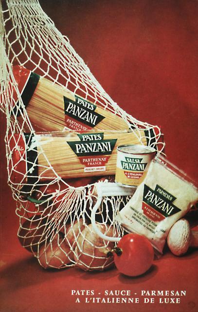
Barthes explains that, for a meaning or ‘sign’ to be gained, a ‘signifier’ and ‘signified’ must be present. In layman’s terms, a ‘signifier’ is something, for example a word or an image, that conveys the meaning, whereas ‘signified’ is a mental concept drawn from the signifier. An example of this would be produce spilling out onto a table, due to the bag being left open (signifier), conceptualising that an individual had just returned from a market with fresh ingredients (signified).

Barthes refers to three types of messages that are usually found within an image – ‘linguistic’, ‘denoted’ and ‘connoted’. But, for the purpose of this ‘research task’, I will only give explanation to the first.

‘Linguistic’ messages are, fundamentally, titles or captions that accompany an image, and are commonly seen in advertisements and press photography. ‘Anchor’ and ‘relay’ are common terms that support a ‘linguistic’ message, and they are used in differing ways. In his essay, Barthes makes this references to ‘anchorage’. “The text is indeed the creator’s (and hence society’s) right of inspection over the image; anchorage is a control, bearing a responsibility – in the face of the projective power of pictures – for the use of the message.” In simpler terms, ‘Anchoring’ is employed to guide the viewer through a number of possible interpretations to the single intended meaning of the image. On the contrary, Barthes defines ‘relay’ as “text and image stand in a complementary relationship; the words, in the same way as the images, are fragments of a more general syntagm”. In other words, ‘relay’ means that text and image are designed to work in unison to convey an intended meaning.

I think a good example of ‘anchorage’ can be seen in a previous assignment I have done, specifically, ‘Vice Versa’. Though, the text has been used as captions, rather than featuring in the images’ themselves, they still help to direct the viewer towards the intended meaning of the photographs’, and restricts them forming their own interpretations that may lead to the intended meaning to be false. https://iainbarbourocaiap.photo.blog/category/assignment-2/

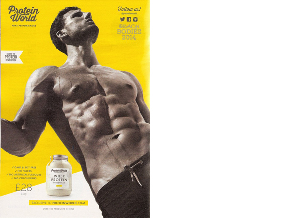
I believe the advertisement below is a good example of ‘relay’, as the text is giving meaning that is not found in the image itself. Essentially, they are working separately and each is supplying their own bit of information to help aid the intended message.

I think understanding the concept of ‘anchorage’ and ‘relay’, would be very beneficial if working on a project, for example, that uses text and image. As both the photographer and the creator of text – if you will – you immediately have control on how you want the photograph’s meaning to be perceived by the viewer. Essentially, you would have an opportunity to influence the viewer, in the way you want them to be influenced.   

References

Barthes, Roland. (1964). ‘Rhetoric of the image’ [Online] Available from: https://faculty.georgetown.edu/irvinem/theory/Barthes-Rhetoric-of-the-image-ex.pdf

The Design Café. (2020). [Online] Available from: http://www.thedesigncafe.net/facebook-advertisments.html

‘races of the real. (2009). ‘The Rhetoric Of The Image – Roland Barthes (1964)’ [Online] Available from: https://tracesofthereal.com/2009/12/21/the-rhetoric-of-the-image-roland-barthes-1977/

Exercise 2: Reflective Day

Due to being in lockdown, I was unable to get “out and about” as suggested in the brief, so have instead found examples of images and text that one may be exposed to in the ‘real world’ from advertisements I found in my home and from browsing social media platforms. I have tried to find examples that relate to directional, orientation and complementary titles.

Directional titles

The example I have chosen that I think relates to a ‘directional title’, is an advertisement from M&S bank that is specifically marketing travel money. In this instance, the text does in fact close the image down, and leaves the viewer very little option to form their own interpretations surrounding its meaning. There are three key elements depicted in the image itself that are commonly used in the tagline to represent ‘holidays’ – sun, sea and sand. With the addition of deck chairs and palm trees, most viewers would associate this ‘scene’ to a luxury destination. The text and image support each other incredibly well, as for many, the type of holiday depicted would indeed be a ‘holiday of a lifetime’. And, though there are many reasons for this, the most obvious and relatable to this advertisement, is financial implications. I think this advertisement is less about travel money, and more about banking in general – specifically with M&S. Perhaps, subliminally, the message they are trying to promote is if people invest their money in their bank, a holiday like the one shown is possible.

Orientation titles

An advertisement that I believe is relatable to ‘orientation titles’, is one created by Swedish company ‘Fjallraven’, who specialise in outdoor equipment. The text used, does close the image down, in regards to informing the viewer about the products that are being promoted. However, due to how the text and image support each other, I believe the viewer is still able to form their own interpretations. By reading the text, we know that the products being advertised are jackets and parkas, produced by a well-known and reputable company. Even if the viewer is unfamiliar with the brand, it certainly reads and sounds Scandinavian, so could be assumed that a company from this region would make quality products of this type. The products themselves have been depicted in a non-obvious way, and certainly aren’t the main focal point within the advertisement. This makes me think that this is less about the products themselves, and more to do with where and how they can be used, because of the qualities they possess. That is why the majority of the image shows a wild and rugged landscape, in an environment that is susceptible to the worst elements, for example, snow.

Complimentary titles

I must admit that this ‘type’ of title is the one I found hardest to understand, so I’m hoping that the advertisement I have chosen is relatable to this. As we can see, the brand that is being promoted is Huawei, who are an ITC company, but more commonly known for their mobile phones. But, if we look at the image, there is nothing depicted that could be relatable to either ITC or mobile phones, apart from the “stay connected” hashtag at the bottom perhaps. Because the text and image don’t support each other in terms of providing a definitive meaning, the advertisement is left very much ‘open’ and allows the viewer to form their own interpretations, which in turn, will help them understand the possible meaning behind the advertisement. Having looked again and again at this advertisement, I still have no idea what the intention is behind it.

Exercise 1: Looking at Advertisements’

I thoroughly enjoyed this exercise, and it was great to recap on specific aspects, which I came across from the ‘Context and Narrative’ module. I decided to concentrate on ‘looking at adverts: 2’ posted on 15/09/14, where Woolley deciphers an advert that is promoting a ‘Protein World’ product. I thought it would make for an interesting task, to read Woolley’s post, after I had deciphered the advert for myself, then compare our thoughts and findings.

Throughout, I took into consideration the notion of ‘semiotics’, and more specifically ‘denotation’ and ‘connotation’, which is essentially the relationship between an object within the image, and its meaning, i.e. signifier and signified.

Denotation = Yellow background.

Connotation = The visually striking background highlights the muted tones of the model and text very well. It also reflects the labels seen on the product itself, and if one were to visit the businesses website, they would noticed the same colour features throughout. The same vibrant yellow is often seen in pop-art pictures, and though they originated in the 1950’s, they certainly had a modern quality for that period. Even today, pop-art is considered ‘trendy’ and is an attractive movement to follow by the younger generation. If we consider psychology and the meaning behind the colour yellow, it represents such things as, energy and emotional strength, but also depression. I found this very interesting when considering the product involved, as many people turn to living a healthier lifestyle – both physically and mentally – if they view themselves as being unhealthy, which can often lead to depression. It could also be a very clever marketing scheme, where sublimely, by using this colour, individuals’ will look at this advert and think that if they don’t but this product, they will develop such things as, anxiety and depression. However, those individuals’ may need to have an understanding of psychology surrounding colours.

Denotation = Young / muscular male model wearing shorts and photographed at an obscure angle

Connotation = The model represents fitness and strength, which is appropriate for the product being advertised. The obscure angle that they have chosen to photograph him has been purposely done to better define his muscles – more so on his chest and stomach – that may have not been as pronounced if photographed square on. The model reminds me of a marble statue one may see in Rome, which again is appropriate for the product, as this is a strong material, and was used as a symbol for purity and immortality. The shorts he is wearing reminds me of a canvas loin cloth that a gladiator would wear when in battle, and the way his right arm is bent, it could be imagined that he is holding a weapon. Gladiators symbolise courage, bravery and, perhaps more importantly in this case, strength.

Denotation = Whey protein product

Connotation = The product has been perfectly placed in the advertisement beside the muscular torso. The viewer’s eye will naturally be drawn to that area after reviewing the product, which, compared to the model, is small in proportion. Again, this has been cleverly thought out, as subliminally, it’s telling the viewer that by using the smallest amount of product, they will see huge gains in their physical appearance.

Denotation = Tag lines and social media icons

Connotations = “Follow us” has been used as a statement, almost like the brand is recruiting people to join an elite club, or start a “protein revolution”, to make changes both socially and culturally across the world. This is fitting to the companies name – ‘Protein World’ – where it gives the impression that the business works on a global scale. This may help promote both product and business, as people usually think along the lines of ‘the bigger the better’. The social media icons – relatable and available to the majority of people – will allow these individuals to join the club – so to speak – at a click of the button, thus promoting the business and product.

It was interesting reading Woolley’s thoughts on the advertisement. Though she picked up on some of the same things as I did, her interpretations of them were different, and as a result, so were her comments. This tells me that people ‘read’ photographs in different ways, and more often than not, the way we interpret what’s in an image and ultimately its meaning, depends on our historical, social and cultural backgrounds and understandings.

References

Open College of the Arts. (2014). ‘Looking at adverts: 2’ [Online] Available from: https://www.oca.ac.uk/weareoca/photography/looking-at-adverts-2/

Protein World. (2020). [Online] Available from: https://proteinworld.com/

Art Fido. (2017). [Online] Available from: https://shop.artfido.com/listing/2737247077/Yellow_Pop_Art_Lizard_in_Suit_Print_on_Loose_Canvas

Medium. (2013). ‘The Angel in the Marble’ [Online] Available from: https://medium.com/@nilsaparker/the-angel-in-the-marble-f7aa43f333dc

Ancient History Encyclopaedia. (2018). ‘Roman Gladiator’ [Online] Available from: https://www.ancient.eu/gladiator/

Design a site like this with WordPress.com
Get started