Though, it’s clear as to what has been depicted in William Eggleston’s images’, interpreting the meaning behind them, or indeed, considering why he chose to photograph that particular scene in the first place, maybe harder to understand. His work could easily be described as banal, portraying objects, which many photographer would disregard entirely. However, Eggleston himself said that the most appropriate answer he can give to those, who ask him why is he photographing a particular subject, is “life today”. But, by applying this mind set in to your personal photography practices, does this make you – the photographer – a storyteller, or a history writer?
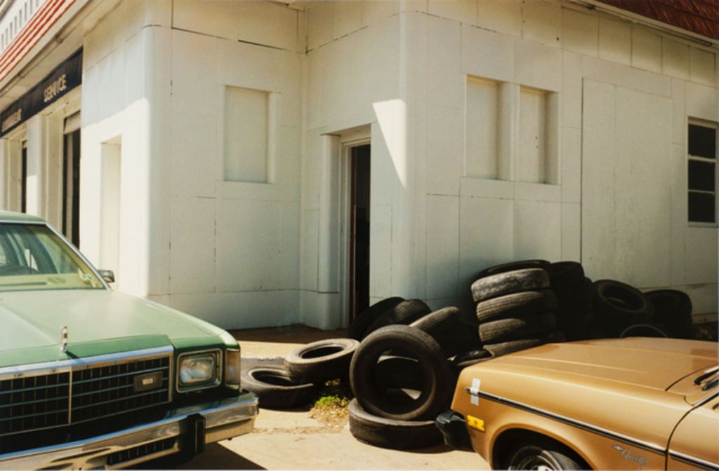
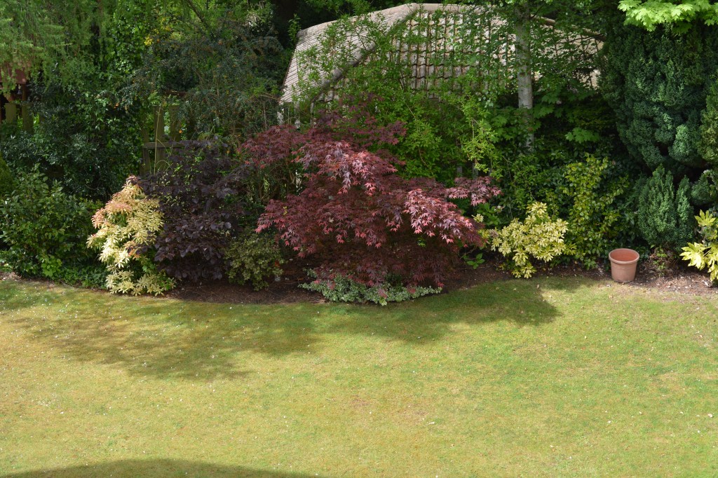
Being a photographer, essentially makes you a storyteller. However, one thing I’ve learnt from this degree, is that the story you intended to tell through your photographs’, isn’t always received in the same way by the viewer. I believe any image can tell a story – with, or without figures present – however, depending on the connection it has with the viewer, for example, on a geographical level – like Memphis – or, how ‘open’ it is for interpretation, may result in different meanings being conceived. Every time a photograph is taken, a snapshot of that moment is transferred either onto film, or into a digital file. Essentially, that image is an historical representation of someone, or something, and how long it remains a part of history depends solely on the photographer themselves – does it end up on the cutting floor, or deleted, never to be looked at again. A piece written by the ‘American Historical Association’, describes history as not “a collection of facts about the past”, but rather, “making arguments about what happened in the past on the basis of what people recorded at the time”. Of course, they are specifically referring to written documents, however, this thinking could also be applied to photography. For example, the image below – taken by Eggleston – could be a case in point between the relationship between tire production and the effects on the environment in doing so, and why they are a necessity in everyday life. Interestingly, I don’t believe Eggleston considers himself as a ‘history writer’. He rarely uses titles or caption to support his photographs, and says by providing dates of when his images’ were taken, “that’s just not about photography”.
Personally, I would consider myself a factual photographer. I’ve an interest in documenting real life moments and people, whilst capturing natural and genuine experiences and responses, which I believe are hard to replicate, if trying to create the same scene artificially. However, this course has allowed me to experiment with my photography in inventive ways, which I’ve certainly enjoyed and appreciated. I’ve been able to incorporate both factual occurrences, with fictitious ideas, to create projects exploring specific personal issues. Due to the creativity aspect involved, the narrative in these instances could be considered as obscure, resulting in a sense of fabrication surrounding the series. Though, I enjoy incorporating this amalgamation of fact and fiction, into my photography, I still much prefer making images’ that depict total reality, and don’t believe I will ever move away from this.
I must say that I’m really looking forward to starting assignment four. Though, I’ve used text before – in some regard – to support my images’, I never really had an understanding of how, and why, to use them together in an effective manner. However, now I’m nearing the end of ‘Part Four’, I feel my understanding – from what I’ve learnt anyway – has improved enough to go into this assignment with a level of confidence that will hopefully see me deliver a solid piece of work, which is relevant to the brief and my desired intentions.
I usually have a number of ideas to explore at this point. However, at present, I’ve only two. That being said, I’m certainly not feeling discouraged by this. The underlying theme will be a continuation from previous assignments within this module, where I will once again explore the notion of coronavirus and lockdown. However, both ideas would see we produce work which is very different to anything I’ve done before, in the fact that ‘people’ won’t be the main subject – in photographic form anyway. I’m excited about this prospect, and feel this particular assignment, which will be part of a larger body of work at the end of this module, needs to diverge slightly in regards to subject matter, to help show my development as both a student, and a photographer.
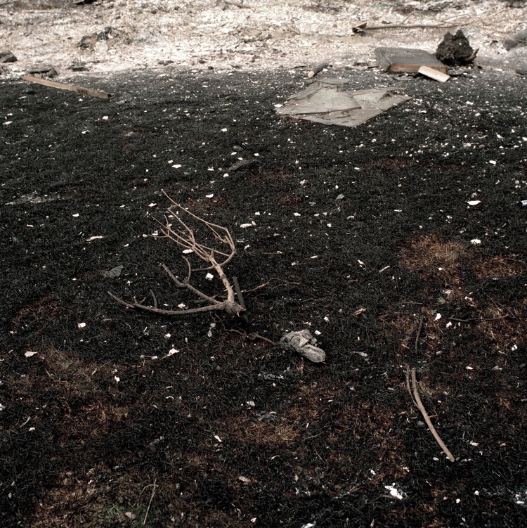
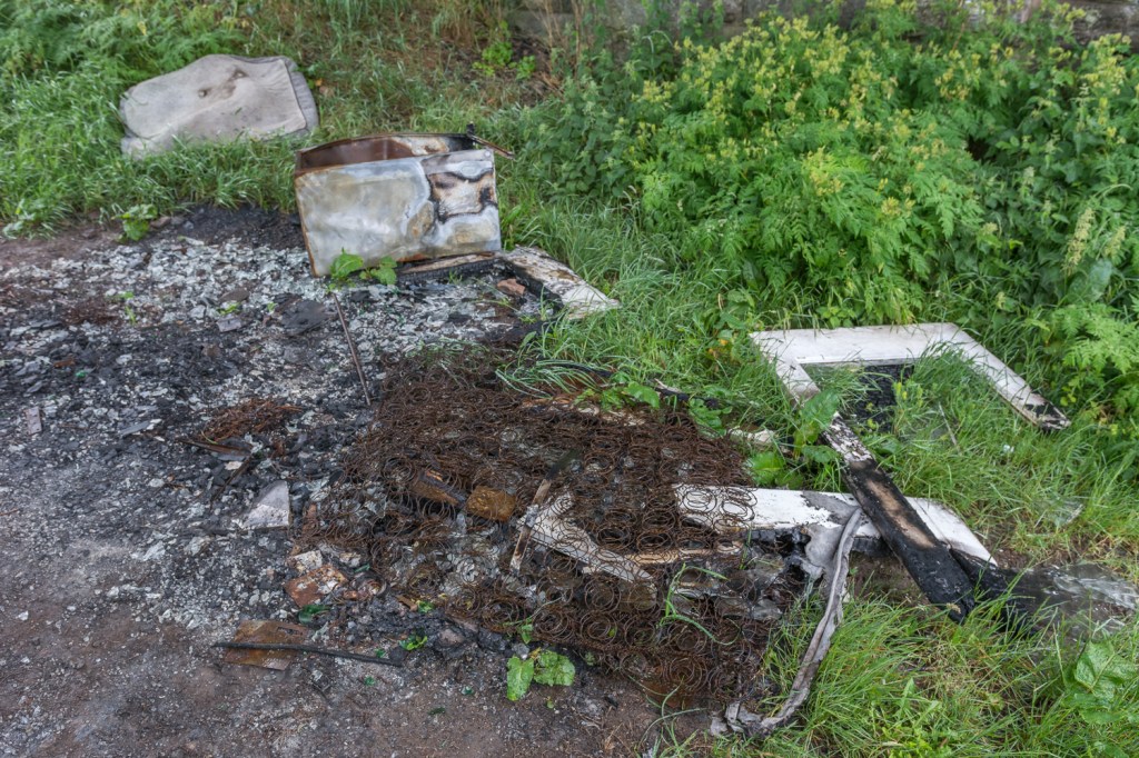
My first idea revolves around the banning of bonfires and campfires, in and around Edinburgh, to “keep the air clean for people who are self-isolating”. Though, this was a regulation that was created back in April, the idea was sparked more recently, when I was out on my daily walk. It was a period when Edinburgh was being blessed by warm weather, and as a result, the general public hoarded to the village where I live, which is considered a ‘beauty spot’ because of the beach and stunning river walks. Apart from many individuals’ clearly ignoring the covid-19 safety advice given to them, I was astonished by how many fires had been lit on the beach, and pockets of dry land hugging the river. At the time, the ‘regulation’ wasn’t at the forefront of my mind, and I was more concerned about the careless scorching made to the grass, plants and some small trees. It wasn’t until later that day, did I remember the banning that was in place, and thought this could make for an interesting project that explores a perhaps less cared about topic surrounding lockdown. I revisited Paul Seawright’s work – in particular the ‘Fires’ series – which I first came across when doing the ‘Context and Narrative’ module. I’ve always felt he managed to capture what could be considered a dull subject – burnt out fires – in a captivating and meaningful way. Seawright’s work can only be described as allusive, and he is known for purposely creating “obscured” narratives that “gives its meaning up slowly”, in order for it not to become too journalistic in style. I feel this is an important factor I must take into consideration, as though my photographs’ – unlike Seawright’s – would include text in some form, they mustn’t be too reliant on the words in order for the viewer to understand their true meaning. Compositionally, each of Seawright’s images’ are similar, and all contain objects that have been damaged by the fire that act as the focal point, ultimately creating the interest that would otherwise make for a featureless photograph. It’s important I try to do the same, however, I won’t know if this will be achievable until I start the photographic process.
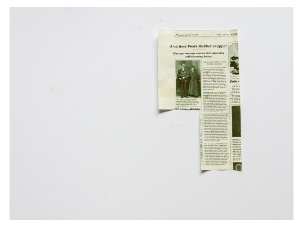
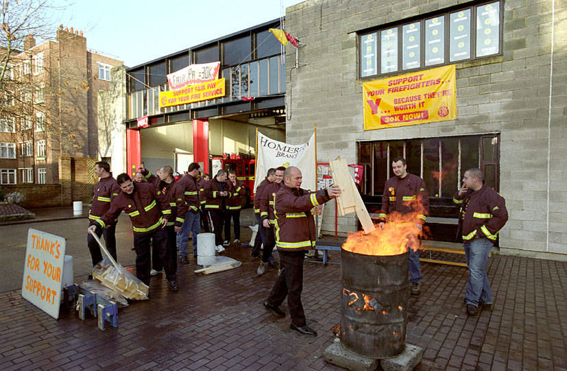
I’ve thought long and hard on how to make the text relatable to the underlying theme, and in which way to present them most effectively. I feel the words need to come from those individuals’ who have been directly involved with the ban. For example, the imposers, or those it’s trying to protect i.e. the vulnerable and emergency services. I’ve found that spoken words in audio form are limited in this regard, and I’ll be reliant on what was said in the papers, and online. This means the text would need to appear in the form of captions, or be presented in another way that’s seen within the image. Though, the caption would be the easiest option, I feel I have an opportunity to be more creative. After reading Michael Colvin’s project ‘Rubber Flapper’, I was impressed by its originality, and the extent Colvin went to, in order to tell his fictitious story. I’ve drawn inspiration from the fake newspaper he created, and feel I could incorporate something similar into my work. I feel however that this wouldn’t be a quick process, and due to strict timeframes, I’m not sure how achievable it is. Another idea I had, and one which is perhaps more realistic, yet still creative, is to produce placards one would see during protests. I think this has relevance to what we are seeing throughout the U.K currently, though, I fully understand this is a different issue altogether. It also has pertinence to the picket lines from 2002, when fire services across the country went on strike to demand better pay. I remember vividly, firefighters huddled around bonfires, waving their placards with messages of their demands. I would use this idea from the perspective of the ‘vulnerable’, and feel that overall, it would be fitting because of the subject matter being explored.
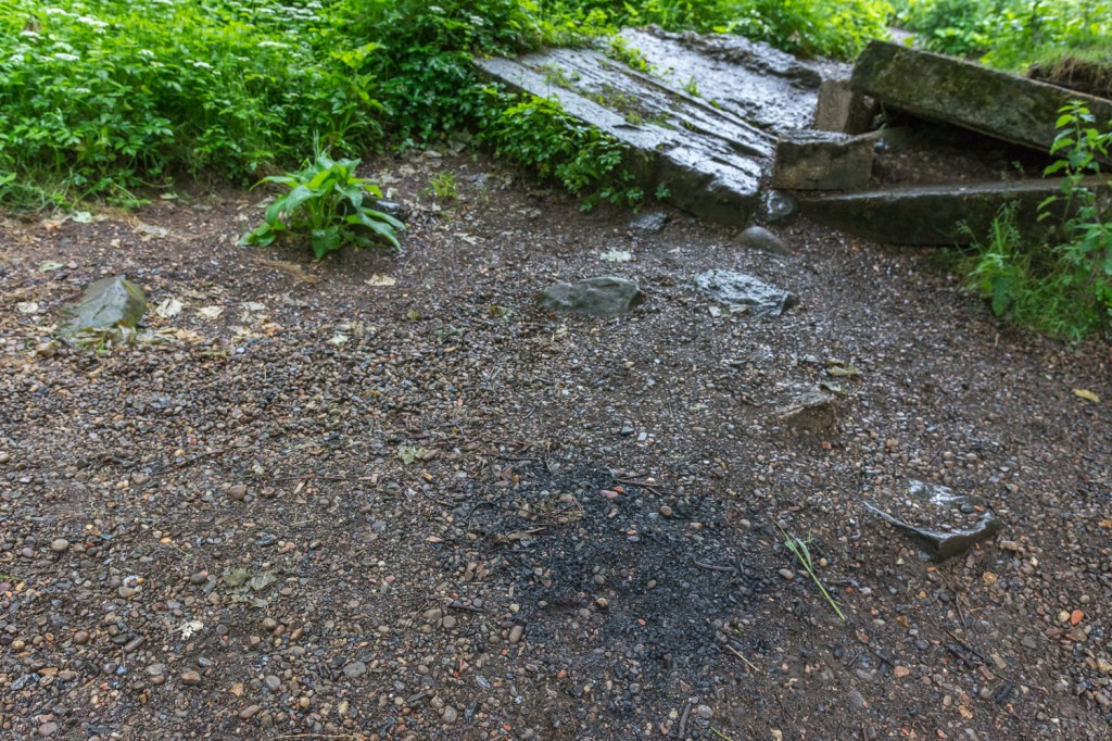
Since my initial research, I’ve been out to see the remnants of the fires, in the hope to plan for the photographic process. Rather annoyingly, a week of bad weather has erased almost all evidence, and quite honestly, they aren’t worth photographing, especially for an assignment. I was at least hoping for some charred items to be evident within the ashes, but at best, only faded scorch marks remain. I did manage however, to take a couple of photographs, to demonstrate my thinking – without the placards of course. In hindsight, I should’ve gone out earlier, as I really think this would have made for an interesting project. I’m not discounting it all together, but understand that I’m reliant on such things as the weather, stricter policing and ever changing policies.
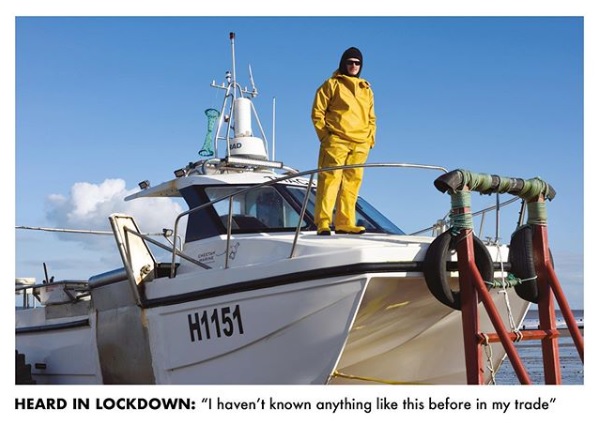
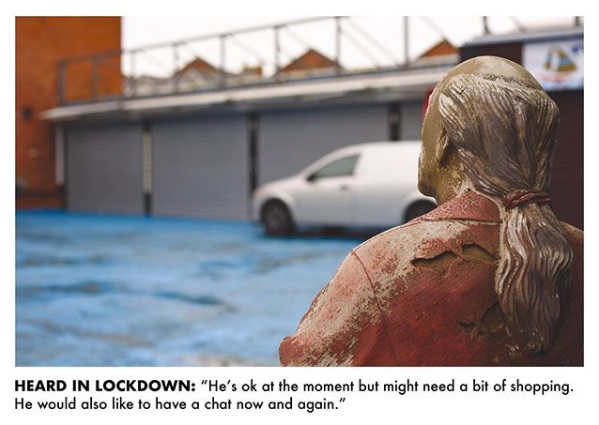
For my next idea, I drew inspiration from OCA tutor, Les Monaghan, who recently produced a series called ‘Heard in Lockdown’. It reflects on the thoughts of six locals to Withernsea, regarding their lockdown experiences. Made to be representative of postcards, each pack was distributed to all residents within the town, in order for them to reply and share their personal stories. Not only is the concept creative and meaningful, the process is reconnecting a community that would have been separated, due to the current events. What interests me specifically – as I hope to achieve this myself – is the relationship between the text and image, and how the chosen words – presented in the way of captions – adds meaning to the photograph, rather than describing what is being depicted. With some of these captions possibly being described as ‘complementary titles’, as a viewer, the way we interpret, and ultimately form a meaning from those specific examples, is certainly challenged because of the relationship between the text and image. For example, on the occasions Monaghan depicts statues within his images’, it could be initially implied that they are responsible for speaking the words, relatable to the caption.
I would produce a similar style project, by reaching out to individuals’, to find out about their thoughts and experiences surrounding lockdown. The text would be presented in the way of audio – specifically the participants’ spoken words – which would support the relevant image. As I’ve not yet received any recordings, I do not yet know what I would be photographing in regards to subject matter. Though, I’m thinking that I would depict within the images’, the elements of nature, to resemble one of the aspects of lockdown, many of us experience less of. I like the idea of incorporating into the surrounding landscape, an item that specifically relates to the text associated with that image. This would also create juxtaposition between the natural, and man-made objects, the viewer would identify. I would need to ensure that the item didn’t mirror the text in literal form, and that it allows for the “viewer’s interpretation to be opened up” – as described in the brief. Until recently, I had great difficult in applying both video and audio to my blog. Below is an example of how I would present my work.
I’m very proud of the work I’ve produced, and though this was an assignment I thoroughly enjoyed, I’m glad it’s now completed. I must admit that I didn’t realise how difficult it would be, to try and produce images’ from spoken text that I hadn’t heard prior to starting the process. There were certainly times throughout, where I really thought I’d bitten off more than I could chew, so to overcome that hurdle gives me a massive sense of achievement. I really wanted to challenge myself, and explore new ways to showcase my work, which I understood was critical for my development as both a student, and as a photographer – I feel I’ve done this.
Taking into consideration past suggestions made by my tutor, I chose to incorporate flash into the photographic process, which is still a relatively new concept to me. Though, I certainly see the benefits, I feel that with more experience beforehand, I would have been able to utilise its functions more effectively, and perhaps, seen better results. However, this entire process is about gradual learning, and developing my skill set within different areas of photography, so I certainly cannot be too critical on myself in this regard. My compositions throughout, had to be carefully considered, and how I framed the scenes in order to best show the props I chose to use, was always at the forefront of my mind. For example, with the ‘briefcase’ image, if I’d chosen to use a different perspective, the money might not have been visible, or easily as identifiable to the viewer, resulting in misinterpretation that may affect the true meaning behind the image. I was also able to effectively use the natural elements – seen in images’ five and six – to create leading lines, helping to draw the viewer’s eye towards to point of interest. The concept of juxtaposition was always going to form naturally throughout the series, due to ‘man made’ objects being depicted within a natural setting. However, this was something I purposely intended during the planning stage, and I hope the viewer picks up on this.
I always love using props in my photography, and though I found this particular part of the process challenging, it always allows me to explore my creativity, and use objects to express meaning in other ways. Choosing the props to use, in relation to the spoken text, had to be selected with careful consideration. I tried very hard not to allow the words to be descriptive of what was being depicted within the image, and ideally, didn’t want the props to mirror the ‘text’ in literal form. I feel I’ve managed to achieve this, though there could be question marks surrounding image five – the telephone. I wasn’t sure at the time, and still aren’t, what prop I could have used, to reflect this selected part of dialogue. However, to demonstrate the individual’s age, and the notion of generational differences, I purposely used a rotary style telephone, and therefore feel that it’s justified. I believe the prop I used most effectively that may be open to interpretation more than the others, are the cogs seen in image one. They were selected to reflect the personal development training the individual describes she has done during lockdown. I also think image six has been well utilised, in regards to the creativity aspect. It represents the common phrase “money doesn’t grow on trees”, meaning money must be earned – something the individual is struggling to do, as a result of his job being affected. Another way in which I’ve demonstrated my creativity, is by using video to present my images and spoken text – something I’ve not done previously. The process was extremely time consuming, and though the editing and presentation could’ve been better – again, part of my learning experience – I still think it was the best way to present my work, and has benefited my project on the whole.
This was an opportunity to use another element within my photography, to help with the intended narrative. Prior to this assignment, I’ve only used visual representations i.e. photographs and written text, to help achieve this. So, to incorporate spoken text in audio form, made for an interesting change. Overall, I feel the narrative is strong, both visually and audibly, and has made for a better project. I now feel I’ve the confidence to use this process – where appropriate – within my work in the future.
Beginning with the positives, my tutor liked the idea of me starting the photographic process, only once all of the ‘lockdown stories’ had been heard. He felt this showed development in my learning and understanding, as it demonstrated giving each participant a sense of identity. I must admit, this was not something that I intended, but I’d like to think that it was done on a subconscious level, as it’s an element of my photography that I’ve been working hard on since assignment one. My tutor also commented on the last sentence I wrote in my essay, which read “This would also make certain that the intended narrative remained open for interpretation, making for a more meaningful project”. He admitted this raised his hackles slightly, was a ‘blanket phrase’, and questioned me on whether a photographic project needs to be open for interpretation to be meaningful. I see this as a positive, because at the same time, my tutor felt this statement seemed “harsh” on the work I’d produced, which to me, shows a level of appreciation on his part, on what I managed to achieve. This has also made me realise the importance of thinking carefully about statements I wish to make, before including them in any written piece. On reflection, I do agree with my tutors comments, and as a result, I’ll remove this sentence from my essay.
There were some areas of the assignment that will need to be re-worked, before assessment. The main issue my tutor had, regarded the sequencing of the images / audio, and the overall edit. As image one was considered, in his opinion, the most obscure in terms of its narrative – something I completely agree with – perhaps this should appear in the middle of the series, which would allow the viewer to gain some form of understanding of its intended meaning, from the photographs’ and ‘lockdown stories’ that are perhaps easier to interpret that appear prior. We had previously talked about starting a series with the ‘best’ image, which was my thought process in this instance. However, I now understand that this notion shouldn’t always be applied, and careful consideration must be made about which photographs appear where, to help strengthen the overall narrative. Also, I realise the importance of consistency, when using video to present your work, and more so, if spoken text has been used to support your images’. For example, the lockdown story – specifically related to image one – is far too long, and inconsistent with the others. This will need to be shortened when re-editing my video for assessment. What I found interesting – again, specifically related to image one – was that my tutor associated the cogs shown, to a personal incident surrounding a bike. This made me wonder if photographs have more impact than spoken word, even when they accompany each other.
I have been encouraged to look at photographers, who incorporate a range of multimedia in their work, for example, Susan Trangmar, or the multimedia section of WPP, as I feel this is an area I would like to explore further in the future. I’m currently looking at investing in the student package of adobe’s creative cloud, in order to improve, and have perhaps have more options when creating videos, specifically when using Premier Pro.
Though I found ‘Rhetoric of the image’ to be a very fascinating essay on Barthes’ outlook on ‘messages’ within photography, his use of intellectual expressions – such as one would expect from a literal theorist – made it at times hard to decipher and digest. Feeling I was reading an extract from a scientific paper, I initially struggled to connect with the piece, resulting in multiple reads to help me grasp a basic understanding.
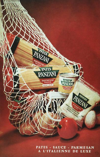
Barthes purposely chose an image from an advertising campaign – ‘Panzani’ – as he believed a globally-recognised subject, which is intended to be expressed forcibly, can be interpreted more easily by the viewer. I immediately thought of advertisement boards found at airports, where, regardless of the country and language they’re in, the meaning behind them is more often than not identifiable.
Barthes explains that, for a meaning or ‘sign’ to be gained, a ‘signifier’ and ‘signified’ must be present. In layman’s terms, a ‘signifier’ is something, for example a word or an image, that conveys the meaning, whereas ‘signified’ is a mental concept drawn from the signifier. An example of this would be produce spilling out onto a table, due to the bag being left open (signifier), conceptualising that an individual had just returned from a market with fresh ingredients (signified).
Barthes refers to three types of messages that are usually found within an image – ‘linguistic’, ‘denoted’ and ‘connoted’. But, for the purpose of this ‘research task’, I will only give explanation to the first.
‘Linguistic’ messages are, fundamentally, titles or captions that accompany an image, and are commonly seen in advertisements and press photography. ‘Anchor’ and ‘relay’ are common terms that support a ‘linguistic’ message, and they are used in differing ways. In his essay, Barthes makes this references to ‘anchorage’. “The text is indeed the creator’s (and hence society’s) right of inspection over the image; anchorage is a control, bearing a responsibility – in the face of the projective power of pictures – for the use of the message.” In simpler terms, ‘Anchoring’ is employed to guide the viewer through a number of possible interpretations to the single intended meaning of the image. On the contrary, Barthes defines ‘relay’ as “text and image stand in a complementary relationship; the words, in the same way as the images, are fragments of a more general syntagm”. In other words, ‘relay’ means that text and image are designed to work in unison to convey an intended meaning.
I think a good example of ‘anchorage’ can be seen in a previous assignment I have done, specifically, ‘Vice Versa’. Though, the text has been used as captions, rather than featuring in the images’ themselves, they still help to direct the viewer towards the intended meaning of the photographs’, and restricts them forming their own interpretations that may lead to the intended meaning to be false. https://iainbarbourocaiap.photo.blog/category/assignment-2/
I believe the advertisement below is a good example of ‘relay’, as the text is giving meaning that is not found in the image itself. Essentially, they are working separately and each is supplying their own bit of information to help aid the intended message.
I think understanding the concept of ‘anchorage’ and ‘relay’, would be very beneficial if working on a project, for example, that uses text and image. As both the photographer and the creator of text – if you will – you immediately have control on how you want the photograph’s meaning to be perceived by the viewer. Essentially, you would have an opportunity to influence the viewer, in the way you want them to be influenced.
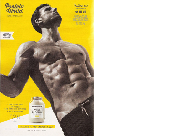
I thoroughly enjoyed this exercise, and it was great to recap on specific aspects, which I came across from the ‘Context and Narrative’ module. I decided to concentrate on ‘looking at adverts: 2’ posted on 15/09/14, where Woolley deciphers an advert that is promoting a ‘Protein World’ product. I thought it would make for an interesting task, to read Woolley’s post, after I had deciphered the advert for myself, then compare our thoughts and findings.
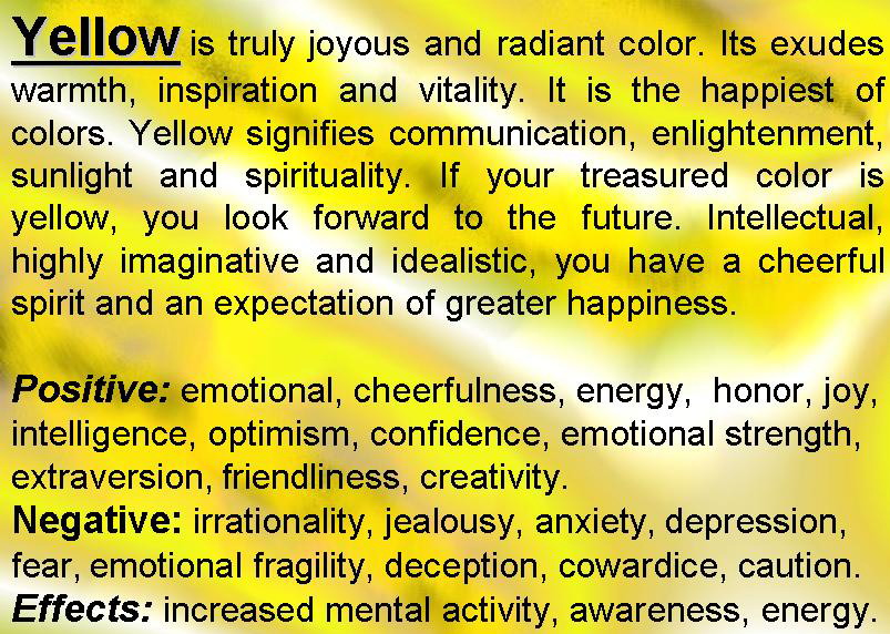
Throughout, I took into consideration the notion of ‘semiotics’, and more specifically ‘denotation’ and ‘connotation’, which is essentially the relationship between an object within the image, and its meaning, i.e. signifier and signified.
Denotation = Yellow background.
Connotation = The visually striking background highlights the muted tones of the model and text very well. It also reflects the labels seen on the product itself, and if one were to visit the businesses website, they would noticed the same colour features throughout. The same vibrant yellow is often seen in pop-art pictures, and though they originated in the 1950’s, they certainly had a modern quality for that period. Even today, pop-art is considered ‘trendy’ and is an attractive movement to follow by the younger generation. If we consider psychology and the meaning behind the colour yellow, it represents such things as, energy and emotional strength, but also depression. I found this very interesting when considering the product involved, as many people turn to living a healthier lifestyle – both physically and mentally – if they view themselves as being unhealthy, which can often lead to depression. It could also be a very clever marketing scheme, where sublimely, by using this colour, individuals’ will look at this advert and think that if they don’t but this product, they will develop such things as, anxiety and depression. However, those individuals’ may need to have an understanding of psychology surrounding colours.
Denotation = Young / muscular male model wearing shorts and photographed at an obscure angle
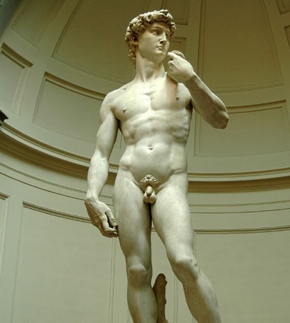
Connotation = The model represents fitness and strength, which is appropriate for the product being advertised. The obscure angle that they have chosen to photograph him has been purposely done to better define his muscles – more so on his chest and stomach – that may have not been as pronounced if photographed square on. The model reminds me of a marble statue one may see in Rome, which again is appropriate for the product, as this is a strong material, and was used as a symbol for purity and immortality. The shorts he is wearing reminds me of a canvas loin cloth that a gladiator would wear when in battle, and the way his right arm is bent, it could be imagined that he is holding a weapon. Gladiators symbolise courage, bravery and, perhaps more importantly in this case, strength.
Denotation = Whey protein product
Connotation = The product has been perfectly placed in the advertisement beside the muscular torso. The viewer’s eye will naturally be drawn to that area after reviewing the product, which, compared to the model, is small in proportion. Again, this has been cleverly thought out, as subliminally, it’s telling the viewer that by using the smallest amount of product, they will see huge gains in their physical appearance.
Denotation = Tag lines and social media icons
Connotations = “Follow us” has been used as a statement, almost like the brand is recruiting people to join an elite club, or start a “protein revolution”, to make changes both socially and culturally across the world. This is fitting to the companies name – ‘Protein World’ – where it gives the impression that the business works on a global scale. This may help promote both product and business, as people usually think along the lines of ‘the bigger the better’. The social media icons – relatable and available to the majority of people – will allow these individuals to join the club – so to speak – at a click of the button, thus promoting the business and product.
It was interesting reading Woolley’s thoughts on the advertisement. Though she picked up on some of the same things as I did, her interpretations of them were different, and as a result, so were her comments. This tells me that people ‘read’ photographs in different ways, and more often than not, the way we interpret what’s in an image and ultimately its meaning, depends on our historical, social and cultural backgrounds and understandings.
I’m feeling a lot more positive going into ‘Mirrors or Windows’ than I did for assignment two, despite still being in lockdown, and feel I’ve some good ideas that if perused, will hopefully enable me to produce a strong set of images. As suggested by my tutor, I’ll continue to explore the theme of ‘lockdown’, but will ensure that the topic of ‘community’ – the premise for this assignment – is met. I’ve done a lot of research into ‘communities’ and have discovered there are broadly speaking, five different ‘types’. These are: community of action, practice, place, interest and circumstance. It is the latter which I think is most relevant to this assignment, and the ‘type’ I will concentrate on specifically, as it explores how communities have been united due to a common situation or challenge not to their making, i.e. coronavirus / lockdown.
That brings me on to the main problem I’m facing currently – the aspect of ‘community’. Due to the current situation, the majority of communities have separated, and are currently non-functional for obvious reasons. Social distancing means that having close interaction with individuals’ – unless done in a safe manner for myself, the subjects’ and the general public – is almost impossible. Of course, there are some types of communities that could be explored. For example, the distant learning community, which is a great example of a ‘mirror’, and like any topic chosen within this category, could be done from the confines of my home, due to its self-reflective nature.
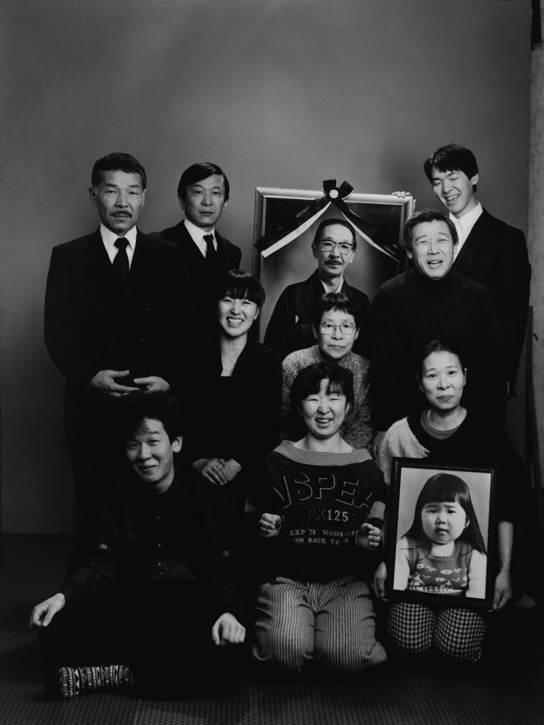
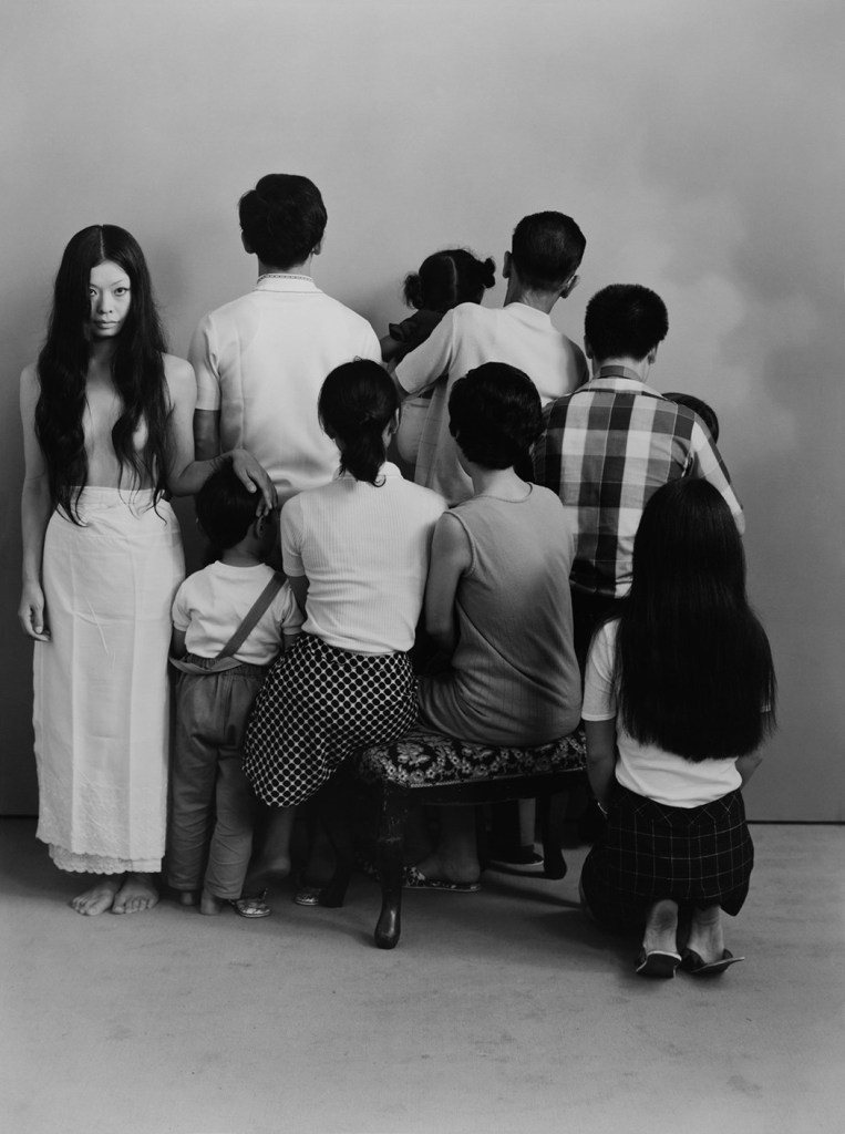
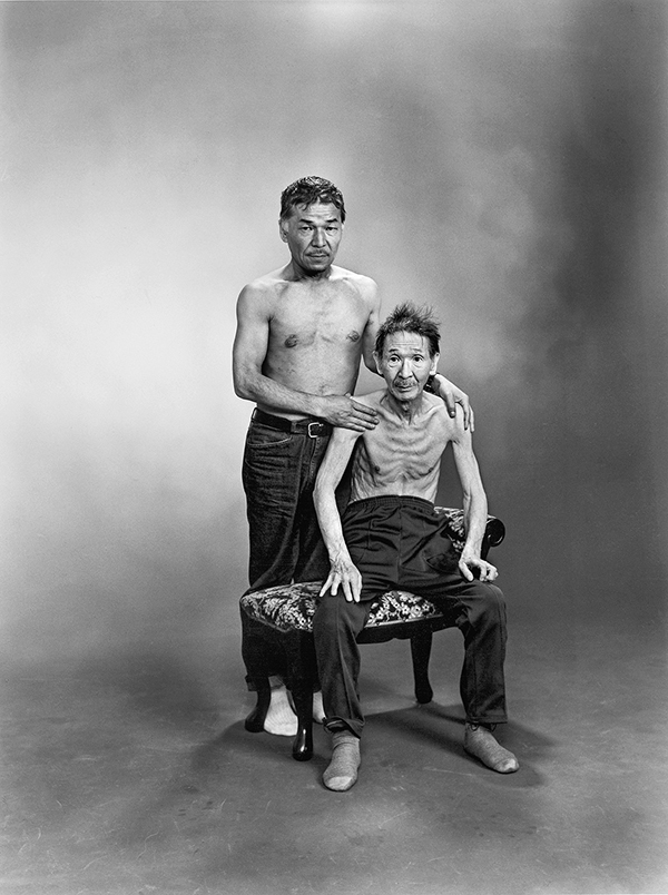
At present, I’ve only one idea that falls under the category of ‘mirror’. Inspired by the work of Japanese photographer Masahisa Fukase – specifically his photographs from the series ‘Family/Kazoku’ – my notion is to create a series of family portrait’s that reflect our feelings and emotions triggered by being in lockdown. Though, Fukase’s intimate portraits – that were taken over almost two decades – explore the theme of time passing and the changes to his family within this period – there are elements I’ve seen in his images that I’ve been drawn to, and feel I could adopt to my own portraits to portray the message I’m trying to achieve. In many of his photographs, we see family members holding up framed portraits of presumed deceased relatives. Of course, this wouldn’t be my reason, but, rather to show the family members we are unable to meet due to being in lockdown. However, the framed portraits used in Fukase’s photographs are large format prints, and his intentions for doing this are clear. Even though these individuals’ are deceased, he’s representing them as if they were present – alive if you will – standing or kneeling beside other family members. As a result, these portraits are incredibly powerful and do leave an impression on the viewer. Unfortunately, I own no large format prints of my family, and because of this, feel my images, in this regard, could lack in what Fukase was able to achieve. In other portraits’, we see his family with their backs turned towards the camera. I’m not certain what this represents, but, perhaps it’s depicting a family looking back (in time) and reflecting on what they were then, and what they’ve become – for better or for worse. Applying this notion within my portraits, my family could be looking back – metaphorically speaking – and contemplating our lives before, during, and even perhaps, after the coronavirus pandemic. I particularly like the portrait that shows Fukase himself, and I believe, his father. They are both topless and depicts clearly the effects ‘time’ can have on the human body. Fukase, who is still relatively young, appears strong and fit. Where his father, an elderly man by this point, appears weak and fragile. My idea is to take a self-portrait – topless of course – showing the effects lockdown has had on my body – specifically my weight gain – due to infrequent exercise that I’m usually accustomed to.
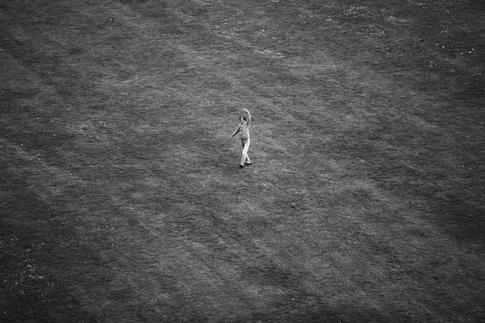
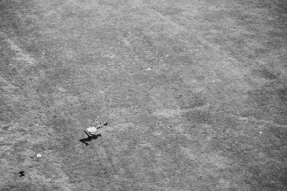
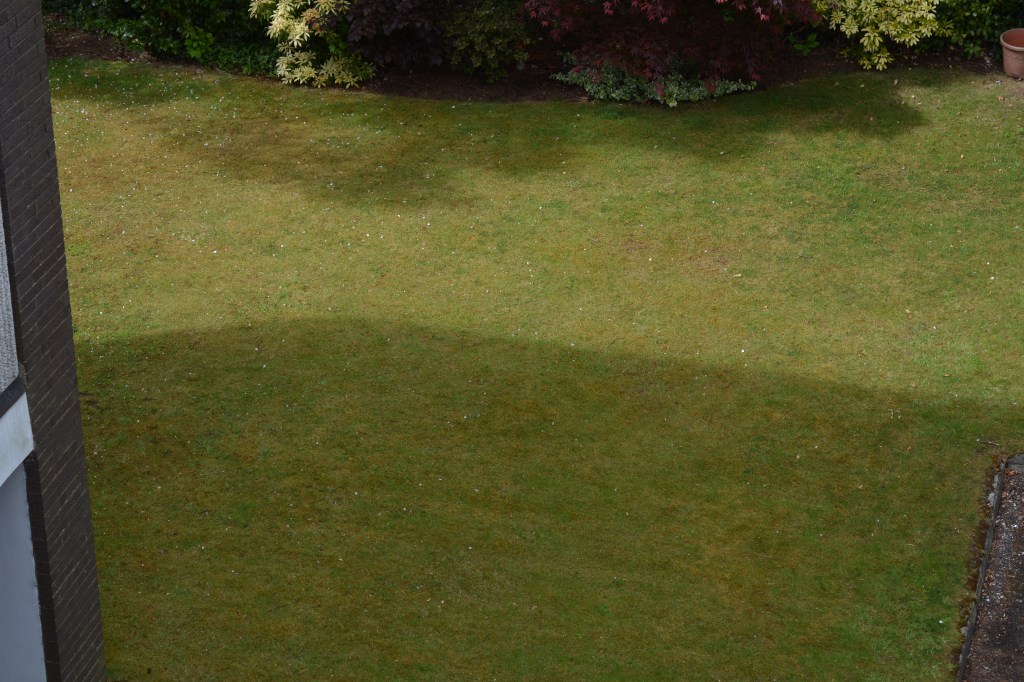
Whilst looking through the ‘photography’ section of the BBC news app, I’ve come across a visually beautiful photographic series aptly named ‘Field (2020)’ by photographer Jemima Yong. Her idea may seem simple, but in fact, it’s an accurate reflection of current times and depicts the notion of lockdown and social distancing extremely well. Her images show individuals’ – families and solitary soles alike – in a field that is overlooked by her home (where she took the photographs from) trying to regain some normality to their lives, if only for a short while. Though, like Yong, we know nothing about these individuals’, as a viewer, we get a better understanding of the communities they may belong to, just by observing the activities they are undertaking. I think this is a very fascinating way of gaining insight into local communities one might be unfamiliar with, and as a result, would allow my images – if I were to adopt a similar approach – to operate like a ‘window’. My ‘field’ would be a small area of garden behind the block of flats where I reside, which is sometimes used by the local residents for various activities – sport, relaxation, work etc. I overlook a section of this garden from my top floor flat, so have a great vantage point for taking photographs in a safe and discreet manner. One thing Yong does extremely well, and a compositional technique I often use, is the use of negative space. I think it isolates the main subject(s) within the photograph, thus, placing a stronger emphasis on them. I’ve taken a couple of test shots, and unfortunately, I’m unable to create the negative space which I desire, due to unwelcomed objects visible within the scene. Of course, there is the option to crop my images to eliminate these objects from the final image, but again, I feel this would be counterproductive in what I’m hoping to achieve visually. However, this certainly isn’t an idea I’ve excluded, and may in fact – after more planning – pursue further.
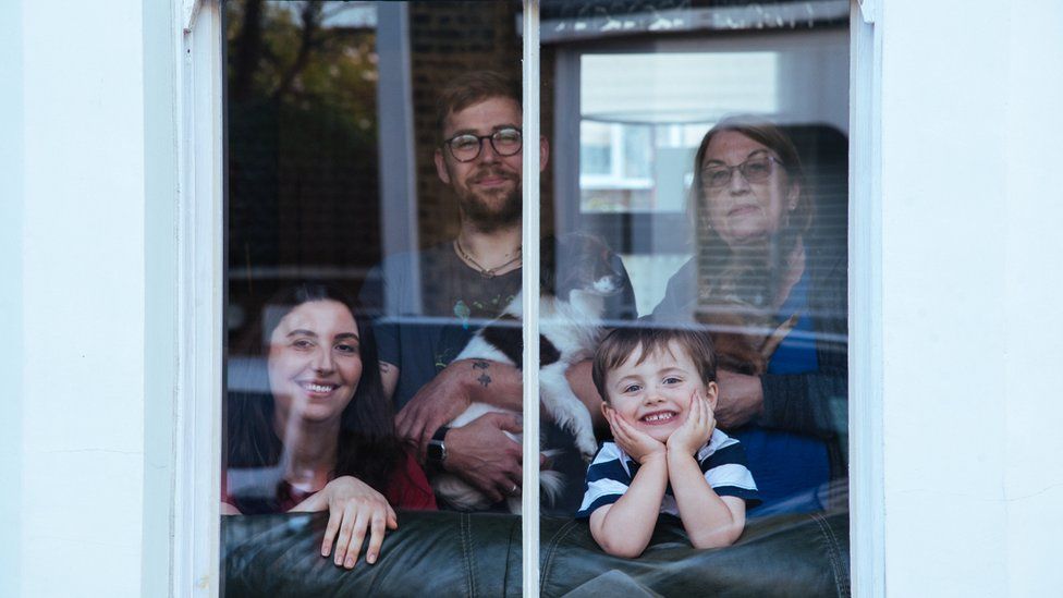
Currently, there are a lot of photography projects being done – surrounding the theme of ‘lockdown’ – where individuals and families alike, are being photographed through their windows or doorways, to represent isolation and social distancing. I’ve thoroughly enjoyed looking through these types of images, and feel they are an important documentation of current events, which will hopefully stand the test of time. However, I’ve noticed on many occasions, details surrounding these individuals’ are vague, and as a viewer, we don’t really get a sense of who these people are. However, I fully appreciate under the current circumstances that each photographer will have limited time with their subjects’, so, obtaining more information on them, just wouldn’t be possible. I’ve thought about ways in which I could create a similar project, specifically related to the communities that the subjects’ belong to. Unfortunately, I will not be able to spend time within these communities – as the brief for ‘windows’ suggests we do – so an alternative method is of course needed, but needs to be one that can be done in a safe manner for everyone involved. I’ve thought about creating a questionnaire – related to communities – that I would deliver around my local area. These documents would ultimately support the portraits of those who completed them – if they chose to participate further – which I’m hoping will offer the viewer a better insight into their community lives. I feel it’s important to strengthen the notion of social distancing, so would take into consideration the idea of ‘distance’. However, it’s vital that the subjects’ don’t become lost in the space created, so using leading lines to draw the viewer towards them is also a factor I must consider. I’ve revisited Tina Barney’s work, to gain a better understanding on how she creates space, and noticed that in many of her images, the inclusion of an open door is used, which results in the photographs depth – or ‘distance’ – being increased instantaneously. I believe I may have opportunities to apply the same photographic technique within my images. I’ve also done some brief research into architecture photography, to see how ‘lines’ – created by the buildings themselves – can be used effectively, which in my case, would be for the sole purpose of leading the viewer towards the subject and perhaps framing.
I certainly feel I challenged myself with this assignment, and could have chosen the more obvious option of ‘mirrors’, which I believe would’ve been an easier process all round. I feel under the difficult circumstances I faced, I adapted to an almost impossible ‘windows’ brief, and by using what I’d consider to be an imaginative alteration in regards to how it was approached, I was still able to achieve what was required. For me, the questionnaire was the safest means to gaining information about communities and those associated with them. However, I do believe under different circumstances, I would have had greater results in regards to responses, and understandably, people were reluctant to take part in the process. Still, those who did, were absolutely fantastic, and I think showed the optimistic spirit that is needed right now. The process of creating the portraits’ was certainly testing, as I usually like to take my time and be methodical with my approach. Of course I wanted to take lots of purposeful images of my subjects’, but at the same time, spend as little time with them as possible, as my primary concern throughout was the well-being for everyone involved. I believe I got the balance right, and though I didn’t overstay my welcome, I took enough photographs of each subject for it to be beneficial when making a selection for the final series.
Technically, the process of taking the portraits’ was relatively straight forward. I swapped between two lenses – 18-35mm and 60mm – depending on the type of image I was trying to create, and what information I wanted included within the scene. I had to use manual focus for images 1 and 2, as the branches / leaves on the trees, and the reflection in the window, affected the autofocus considerably. I very rarely use manual focus, but as both subjects’ were fixed in one place, it wasn’t a difficult undertaking. My compositional technique is something I’ve been working very hard on, and I believe this is reflected in my images. Emphasising the notion of social distancing and isolation for the viewer, whilst making sure the subject remained the focal point, was probably the most important factor to consider, but the hardest to achieve. Consciously using leading lines in my photography isn’t something I do often, so having to view a scene and determine where to place my subject, based on what ‘lines’ will be most beneficial in terms of making them the point of interest, whilst considering the composition as whole, was very challenging for me. However, I think my use of leading lines are very effective and purposeful, and actually, apart from image three, are quite subtle. Framing my subjects’ effectively was easier to achieve, as the building structures themselves – on some occasions – created these frames for me. My subject in image one though, was the hardest to ‘frame’. Because I wanted the distance between myself and the subject to be less than the others – because I was able to – I ultimately removed the natural, but perhaps obvious ‘framing’ object from the scene – the window frame. However, I noticed the reflection of the dark hedge in the window, and felt it would work well at both highlighting my subject, but framing them also. I’m very pleased that I’ve be able to apply layering and depth within all my images – even image one which I didn’t think would be possible. I think the best example of this though is seen in image four, where by simply placing the subject to the side of door frame, the viewer is able to see to the very back of the scene, making it appear larger than it actually is. Plus, we get to see an interestingly designed door, which is also acting as a back light for the subject. The concept of juxtaposition is something that took me a while to understand, and honestly, is something I’ve never considered applying into my photography until this assignment. I tried very hard to depict both natural and manmade elements i.e. the buildings, and think there is a nice balance of each within all portraits’. I particularly like image four in this regard, as the ‘natural elements’ are subtle and requires the viewer to investigate the image closely to receive that information.
I always like to be creative as possible with my photography, and this assignment was no exception. I could have easily produced eight images of individuals’ standing at windows or in doorways, but that would have made for a rather boring and repetitive set of images. Instead, I used a variety of locations, and particularly enjoyed choosing objects that would represent the subjects’ ‘barriers’ to emphasis the idea of social distancing and isolation. Image two is a great example of this, as by just making the subjects head visible, it gives the impression that he doesn’t want to expose himself too much to other people. It also makes for quite an amusing photograph, despite the negative connotations surrounding it. I also tried to experiment with visual perception, and think the images’ where this has been applied work well. Obviously, for images’ three and five, I had no choice to photograph the subjects’ from below, so the perception created was inevitable. However, for image six, I purposely stood on top of the hill – which I didn’t have to – to get a view of looking down on the subject that ultimately helps create distance.
Overall, I’m very happy with the way I approached this assignment, and ultimately, with the images that I have produced. I think the questionnaires support the portraits’ effectively, and offers the viewer some insight into who the subjects’ are and the communities they are linked to. I have carefully considered the order my images should be presented in, and though I feel they all have a place within the final series, the images I consider ‘better’ are at the start of the set.
As my tutors report can be found on my blog, I won’t repeat what has already been written, but will however, reflect on some of these points further and mention topics that have not been included that I believe to be important for my development.
To be honest, only a short time from our discussion was spent talking about my assignment. However, from the feedback I did receive, I left the call feeling happy with the thoughts my tutor had on it. Overall, he appreciated the effort I put in – especially under the difficult circumstances – and thought the inclusion of a questionnaire was a clever way of gaining information about individuals’ and their communities, but also made the project more ‘personal’ – something I’ve been working hard on since assignment one. He also noted the variety between each of my images’, which I was pleased about, as this was an important part of the brief and something I worked hard on to achieve. We discussed the use of flash – again – and how by using it, my images would benefit greatly, if used in the right situations. For example, he felt that if I had used flash in image four and six, it would have acted as a fill light, highlighting the subjects’ and enhancing them within the image. We have discussed using flash before, so for the next assignment, I must use it if I think it will be beneficial.
My tutor made a very good point about my presentation of my posts on my blog. I currently do this in a very systematic way, for example my ‘initial thoughts and preparations’ are at the top, with my selection of images near the bottom. He explained for assessment purposes, I need to do this differently, and by having an ‘assessment’ tab perhaps, produce a short written explanation that supports each assignment, followed by the relevant images. This means if the assessors want to read such things as my main essay, or my ‘reflections’, they can do so by navigating through a separate tab.
We discussed the importance of why images should ‘sit well’ together within a set, and ways of achieving this. My tutor mentioned he makes prints of his photographs, as having physical copies in front of you, is very much different to reviewing them off a screen, for example. That got us talking about printers, and if it would be worth me investing in one. I’m still not sure, and think it might be cheaper, but perhaps not easier, to have an online printing company do this for me. I learnt about a process called ‘lightjet’ printing, which sounds interesting and something I will do further research on.
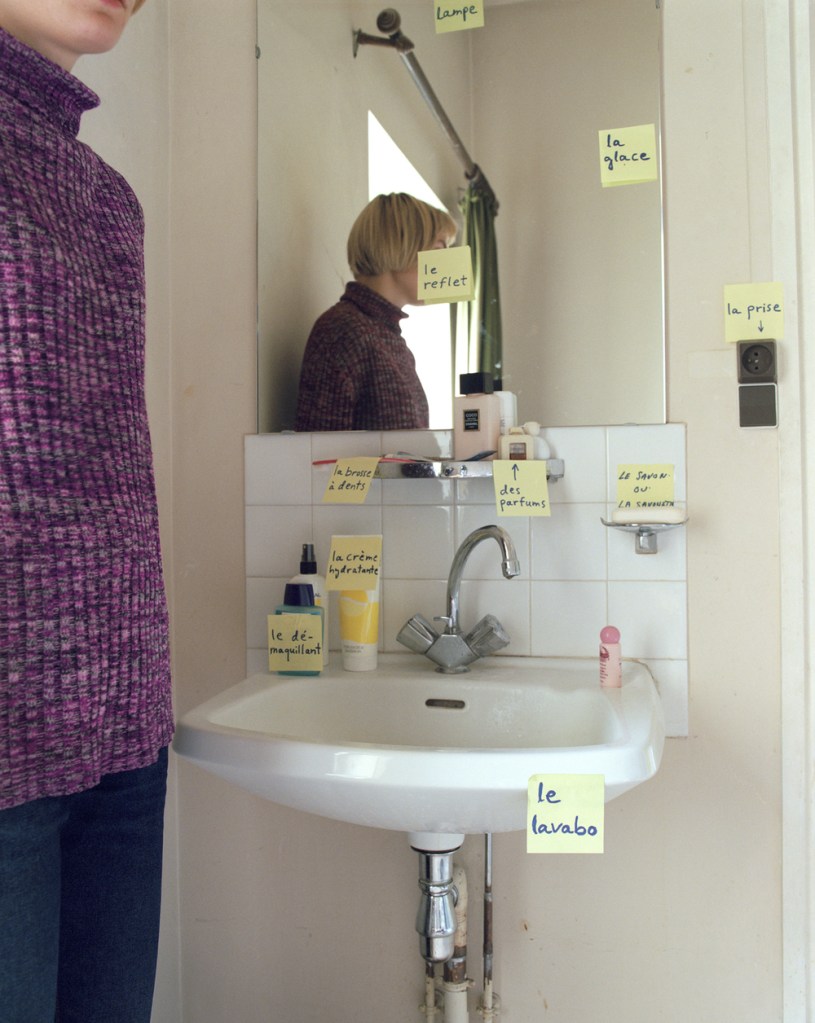
I thoroughly enjoyed watching the video of Elina Brotherus talking to OCA students’ about her work and in particular, how you can use yourself – the photographer – as the subject. It was evident to me that even simple tasks we do, could possibly lead to a photography project, and as ‘artists’, we need to be more aware of this. I’m specifically referring to the period in Brotherus’s life when she moved to France and stuck post-it notes on to everyday objects, in order to learn them. For most, this would have been a requirement, simply to learn a new language. But, Brotherus saw this as an opportunity to turn this into a personal and meaningful project that explored her experiences living in a foreign country, whilst trying to adapt to cultural and environmental differences. What I find inspiring, is that she continued with the theme of using post-it notes, in her series ’12 years later’. However, the descriptions this time, often consist of lengthy dialogues, which describe her thoughts and feelings about looking back on her life from when she first visited her residency in 1999, and how her life, if at all, has changed. What I find particularly interesting about this, is that despite the timeframe between the two projects, they just work, both visually and contextually. That got me thinking about my future assignments, and how under the current circumstances, the theme should be relatable from one to the next, in order to from a larger piece of work. This will hopefully show an evolution of my experiences, where, like Brotherus, I could draw up a conclusion or even write a ‘position statement’ of how I’ve changed – again, if at all.
I think if photographers are to use themselves as the subject’s in their own work, they need to think carefully about what was, or is, meaningful in their lives, in order to draw inspiration for possible themes, where the end result will be a series of images that are genuine and has significance to them. That, I think, is the most important factor to be considered and hopefully achieved when creating a piece about yourself, and what others interpret from viewing your images, is perhaps irrelevant. One thing that is evident in a lot of her work, is the inclusion of the cable release. Asked, why she decides to keep this visible for all to see, she replied “it’s important to show me as both the model and the author”. I find this to be such a fantastic response, and reconfirms to me the personal aspect of her entire process. Where some photographer’s may find this unsightly, perhaps unprofessional, for Brotherus, it’s what makes her images unique to her.